
Shinola vs Fossil — Is the $600 Difference Actually Worth Paying?
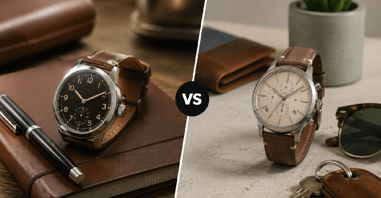
The Shinola watch pitch is one of the most effective in American retail. Made in Detroit. American craftsmanship. Workers paid fairly. A brand built on the revival of manufacturing in a city that had lost so much of it. The watches look genuinely beautiful — the Runwell in particular is the kind of watch that makes you feel like you’ve made a considered, values-aligned purchasing decision rather than just buying something you liked the look of. The Fossil pitch is considerably less romantic. Fossil is a Dallas-based company that makes fashion watches at accessible price points, primarily in Asia. The watches look good. They use reliable movements. They cost a fraction of what Shinola charges. The price gap between a comparable Shinola watch and a comparable Fossil watch is somewhere between $350 and $700 depending on the model. I want to tell you honestly what you get for that difference because I think most of the coverage of Shinola either overcelebrates the Made in America story or dismisses the brand as overpriced without engaging seriously with what the product actually delivers. The Detroit story — what’s real and what’s marketing Shinola was founded in Detroit in 2011 by Tom Kartsotis, who previously founded Fossil. This fact is worth sitting with for a moment. The man who built Fossil — the accessible fashion watch company — founded Shinola as a premium alternative. He knew exactly what the difference between the two products was going to be and he built both. The assembly in Detroit is real. Shinola watches are genuinely assembled in their Detroit facility. The workers are paid American wages. The brand has invested in manufacturing infrastructure that actually exists, not just in marketing imagery. What is also real: the watch movements in Shinola watches are not made in Detroit. The movements — the mechanical heart of the watch that actually keeps time — are sourced from Swiss and Japanese manufacturers (primarily Ronda and Miyota, depending on the model and era). This is not unusual in the watch industry. Very few brands at any price point make their own movements. But it’s something that the “Made in Detroit” story can obscure if you’re not looking for it. This matters when you’re evaluating the price premium. The Shinola price includes: American assembly, American wages, American brand story, real quality finishing on the case and dial, and a movement that’s reliable and well-specified but not exclusive to Shinola. The actual watch quality — case, dial, strap, finishing The Shinola Runwell is the reference point I’m using here. It’s their iconic model, the one that shows up most in editorial coverage, and the one that best represents what Shinola does at its best. The case finishing on the Runwell is excellent. The polished and brushed surfaces are clean and precise. The dial print is sharp and consistent. The date window — a small detail that often looks cheap on fashion watches — is properly framed. The lume application on the hands is neat. These are genuine quality signals that you can see and feel. The strap options on Shinola vary. The leather straps from their Detroit facility are well-made and break in nicely over time — they have a quality that comes from decent leather properly finished, which is different from the pleather straps on fast-fashion watches even when both look similar new. The NATO and other fabric straps are well-executed. The overall wearing experience is solid. The watch sits on the wrist well, the case proportions are classic without feeling dated, and the movement — Ronda or Miyota depending on the model — keeps accurate time reliably. Fossil — what you’re actually getting Fossil’s Neutra and Heritage lines are the clearest comparison points to Shinola’s core offering — classic, round dial watches with clean aesthetic choices at $100-200. The case finishing on Fossil’s better pieces is good but not Shinola good. Up close, the polishing is slightly less precise, the dial text is very slightly less sharp, the case finishing shows more compromise. These are not dramatic differences and most of them disappear at normal viewing distance. But side by side with a Shinola, a Fossil looks like a fashion watch and a Shinola looks like a watch. The Fossil movements are reliable. Fossil has built their business on accessible watches that work consistently and they’ve been doing it long enough to have figured this out. The Miyota movements they use in their better pieces are the same movements in many watches that cost significantly more. Time-keeping accuracy is not where Fossil compromises. The straps on Fossil watches are where the quality gap is most apparent. The leather is thinner and stiffer than comparable Shinola leather, and it doesn’t break in as gracefully. The buckle hardware feels lighter. These are the places where the price difference shows most clearly in everyday use. The honest price-quality relationship Here is the direct answer: the Shinola Runwell is not three times better than a comparable Fossil watch in any objective sense. The movement is similar. The timekeeping is comparable. The basic function — telling you what time it is reliably — is identical. What Shinola offers for the premium: better finishing, better strap quality, a purchasing experience that includes the brand story and what it represents, and a watch that reveals its quality in close examination rather than disappearing into its price point the way good fashion watches do. Whether those things are worth $400-700 more is a values question as much as a quality question. For someone who cares about buying American-assembled products with the understanding of what that means and doesn’t mean, and who values the watch category enough to want something that reveals its quality on close examination: Shinola is a reasonable choice at the price. For someone who wants a well-made, attractive, reliable watch at an accessible price without any of the brand story attached to it: Fossil’s better pieces deliver this honestly and without pretense. Neither is wrong. They’re
Caraway vs Our Place — Both Are Beautiful. Only One Cooked Better in My Kitchen.
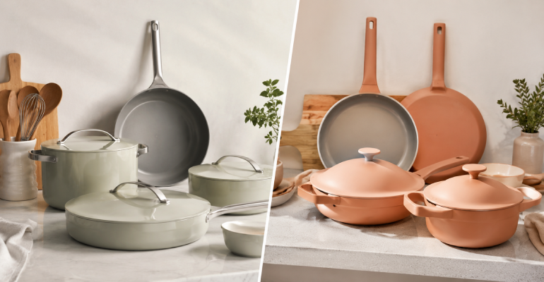
There is a specific type of cookware purchase that I think a lot of people make. You’ve decided you want to upgrade from the old nonstick pans you’ve been using for years, the ones where the coating is starting to look questionable and you’re not entirely sure what you’ve been ingesting. You want something that performs well, doesn’t contain the chemicals that older nonstick coatings were made with, and looks good enough that you don’t feel the need to hide it when people come over. You’ve seen both Caraway and Our Place everywhere — Instagram, the kitchens of people whose homes you admire, every gift guide written in the last four years. You need to pick one. I have been cooking with both in my actual kitchen for long enough to have real opinions that aren’t based on first impressions or marketing materials. Here’s what I actually think. The brands and what they’re selling Caraway launched in 2019 with a clear premise: make ceramic nonstick cookware that looks beautiful, performs well, and comes with a storage system that solves the pan organization problem most kitchens have. The Caraway set — four pans, lids, and the magnetic pan rack and lid holder that hold everything together — was designed as a complete kitchen system rather than individual pieces. The colors are considered. The design is consistent. The whole thing photographs extremely well, which in 2019 was not incidental. Our Place launched a year earlier, in 2018, but became famous in 2020 with the Always Pan — a single pan claiming to replace eight pieces of cookware. The Always Pan can sauté, steam, strain, braise, and sear. It has a built-in strainer lid and a wooden spoon holder. The premise is that you need less, not more, and the best kitchen setup is one that’s edited down to the pieces that actually do the work. The aesthetic is similarly considered — the colors are distinctive, the design is clean, and the Always Pan in particular became a cultural object in a way that few pieces of cookware ever do. Ceramic coating — what it means and what to expect Both brands use ceramic nonstick coatings instead of PTFE (what most people call Teflon). This matters to a lot of people for health and environmental reasons — ceramic coatings don’t contain PFAS chemicals and don’t off-gas the way older nonstick coatings can at high heat. What ceramic coatings also don’t do, that PTFE coatings historically do better: maintain their nonstick properties indefinitely. All ceramic nonstick coatings degrade over time. The questions are how quickly, under what conditions, and what you can do to slow the process. Caraway’s coating handles this degradation more gracefully than Our Place’s in my experience. After consistent use over multiple months, the Caraway pans maintained their slickness noticeably better than the Our Place Always Pan. Eggs still slid cleanly in the Caraway longer than they did in the Always Pan. This could be a care difference — ceramic coatings are more heat-sensitive than people expect, and cooking on anything above medium heat regularly accelerates coating breakdown — but I was using both with equivalent care. The Always Pan — the real honest take I want to spend time on the Always Pan specifically because it’s Our Place’s flagship and the product most people are deciding between when they’re comparing these brands. The Always Pan is genuinely clever as a design object. The steam basket fits inside the pan. The lid has a strainer built in. The wooden spoon rest on the handle is a small detail that sounds like a gimmick until you have a toddler and every saved step matters. The pan is beautiful in a way that makes cooking in it feel more enjoyable, which is a real effect even if it’s a soft one. The cooking surface is 10 inches. This is the limitation that matters most in everyday use. Ten inches is fine for eggs, fine for sautéing vegetables for two people, fine for sauces. It starts to feel genuinely constrained when you’re cooking protein for more than two people, when you want to sear anything that needs space around it to brown properly rather than steam, or when you’re making a sauce that benefits from a wider evaporation surface. The Always Pan is a brilliant one-person or two-person weeknight cooking tool. It is not the pan that replaces eight pieces of cookware in the way the marketing suggests if you’re regularly cooking for a family. The 2024 and 2025 versions of the Always Pan addressed some earlier durability complaints. The coating has held up better in recent iterations than earlier versions did. Our Place responded to criticism thoughtfully rather than ignoring it, which I think deserves credit. Caraway — what the set actually delivers The Caraway set — which includes a 10.5-inch fry pan, 3-quart saucepan, 6.5-quart Dutch oven, and 4.5-quart sauté pan — covers more cooking ground than the Always Pan, and the size range means you’re using the right pan for the right job rather than adapting everything to one vessel. The 10.5-inch fry pan is the piece I use most. It heats evenly, food releases cleanly for longer than I expected, and it handles the range from delicate eggs in the morning to browning vegetables for dinner without requiring temperature adjustments that feel like working around the tool rather than with it. The Dutch oven is the surprise standout. Braised dishes, soups, anything that starts on the stovetop and goes into the oven — the Caraway Dutch oven does this as well as anything I’ve used at double the price. It’s substantial without being unwieldy and it holds heat beautifully. The magnetic storage system that comes with the set deserves more attention than it typically gets. Pan storage is genuinely one of the least-solved problems in most kitchen setups, and the Caraway system — where pans stack on a magnetic rack that sits on a counter, lids in a separate
Greenlight vs GoHenry — Which Kids’ Debit Card Actually Teaches Money Skills?
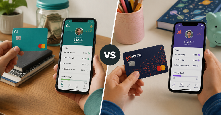
Teaching kids about money is one of those parenting intentions that sounds simple and turns out to involve a specific set of frustrations. Cash doesn’t work the way it did when we were kids — there’s nowhere to spend it, kids don’t have it, and handing your eleven-year-old a twenty for pocket money tells them nothing about what money is or how to manage it in a world where almost everything happens on a screen. Greenlight and GoHenry both exist to solve this problem. They both give kids a real debit card, parental controls, allowance automation, and some version of financial education built into the app. They both claim to be the best way to teach your kids money management skills. Having used both — one with an older child who had opinions about the experience and one with a younger child who mostly cared whether they could buy things — here’s what the actual difference is. The core mechanics — how each one works Greenlight works like this: parents create an account, add children, and transfer money to the parent wallet. From there you can allocate to each child’s spending account, savings account (with a parent-paid interest rate you set), and giving account. Kids have a physical card that works anywhere Mastercard is accepted. The parent app lets you see every transaction in real time, set spending controls by merchant category, and approve or decline transactions. The Greenlight app for kids shows their balances, their savings progress, and some financial education content depending on which subscription tier you’re on. GoHenry works similarly. Parent account, child cards, real-time transaction visibility, parental controls. The GoHenry card is Visa. The app has spending controls and allowance automation. The GoHenry kid-facing app includes what they call Money Missions — short financial education activities that teach concepts through games and quizzes. This is GoHenry’s most distinctive feature and the one that most differentiates it from Greenlight’s approach. Financial education — the thing that actually matters most If you’re buying either of these products, the card itself is not really the point. Your eleven-year-old can use a debit card from any bank. The point is whether the product actually teaches them anything about money. GoHenry’s Money Missions are genuinely good. The activities are age-appropriate, reasonably engaging, and cover real concepts — budgeting, saving toward goals, understanding interest, the basics of earning versus spending. My older child engaged with the Money Missions more than I expected, which is a meaningful endorsement because she approaches most educational app content with visible skepticism. The missions have a game-like structure with progress tracking, completion badges, and certificates. This works better for younger children (roughly 6-12) who respond to that kind of gamified feedback. For teenagers, the gamification can feel condescending — the completion badge for a financial literacy module doesn’t carry the same appeal at 14 that it does at 9. Greenlight’s financial education content varies significantly by subscription tier. The basic tier doesn’t include much structured learning — it’s primarily a money management tool. The Greenlight Max tier includes investing for kids (actual fractioned shares), which is genuinely impressive as a feature and genuinely useful for teenagers who want to understand how markets work. If your goal is financial education for a teenager specifically, Greenlight Max’s investing feature is the most sophisticated offering in the children’s fintech category. The parent experience — what it actually feels like to manage this The parent-side of Greenlight is more polished than GoHenry’s. The transaction notifications arrive faster. The spending controls are more granular — you can block specific merchant categories, set per-store limits, and customize in ways that GoHenry doesn’t quite match. For parents who want detailed control over where money can be spent, Greenlight gives you more options. The GoHenry parent experience is simpler, which is either a limitation or a feature depending on your parenting approach. The controls are sufficient for most families’ needs. The interface is cleaner in some ways because there are fewer options to navigate. The weekly money summary that arrives by email is a nice touch that keeps you aware of your child’s spending without requiring you to open the app constantly. Both apps send real-time notifications for every transaction. Both let you transfer money immediately. Both let you automate allowance payments on whatever schedule you choose. These core functions work well in both products. Pricing — what you’re actually paying Greenlight Core: $4.99/month for up to five children.Greenlight Max: $9.98/month, adds investing and identity theft protection.Greenlight Infinity: $14.98/month, adds additional family features. GoHenry: $3.99/month per child in the US. UK pricing is £3.99/month per child. This per-child pricing matters for larger families — one child is cheaper than Greenlight, two children is comparable, three children is more expensive. The free trial periods both offer (GoHenry typically offers 1-2 months free, Greenlight offers 30 days) are worth taking advantage of before committing. These products are habit-forming in the best sense — once kids start using them and start seeing their savings grow, they become invested in the system — so the trial period tells you more than reviews do whether your specific family will engage with it. Age range — who each product actually serves GoHenry is better for younger children. The Money Missions structure, the simpler app interface designed for kids, and the overall experience is calibrated for 6-12 more than 13-18. Greenlight serves a wider age range more effectively. The basic product works for younger kids. The investing feature genuinely engages older teenagers in a way that no financial education game module really does, because real money in real markets is inherently more compelling than any gamified simulation of it. Greenlight serves a wider age range more effectively. The basic product works for younger kids. The investing feature genuinely engages older teenagers in a way that no financial education game module really does, because real money in real markets is inherently more compelling than any gamified simulation of it. Honest recommendation For
Eight Sleep Pod 4 vs ChiliPad — I Tested Both. One of Them is Hard to Justify.
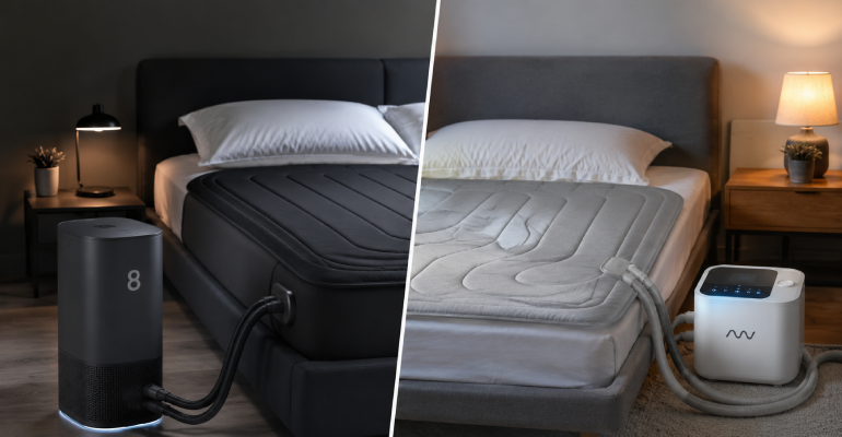
Hot sleeping is one of those problems that sounds minor until you’ve had it for long enough. Then it’s every night. Then it’s the thing you think about before bed, the reason you wake up at 2am, the reason you’re dragging yourself through the next day with a specific kind of tired that isn’t about hours slept but about quality. I knew all of this about myself before I started looking at bed cooling systems. What I didn’t know was how confusing the market would be, or how much money I’d spend finding out what actually worked. I want to be upfront about something before this review gets going. Eight Sleep’s marketing is some of the best in the sleep industry. The Pod 4 looks extraordinary. The app interface is genuinely impressive. Their partnerships with professional sports teams and sleep scientists give the whole thing a credibility that’s hard to shake even when you’re trying to approach it objectively. I say this because I want to acknowledge that I went into testing the Pod 4 with a bias toward it being worth the money, and what I found complicated that bias in ways worth talking about honestly. What each of these things actually does Eight Sleep makes what they call a smart mattress cover. The Pod 4 fits over your existing mattress like a very thick fitted sheet. Inside the cover is a network of water tubing. The tubing connects to a hub unit that sits beside your bed. That hub chills or warms water and circulates it through the tubing all night, keeping the sleep surface at whatever temperature you’ve set or whatever temperature the app’s AI decides you need based on your sleep stage data. The system also tracks your sleep. Heart rate, breathing, movement, time in different sleep stages — all of this is monitored through sensors in the cover without you wearing anything. It integrates with the app to show you your sleep health data and, if you’re using the autopilot feature, automatically adjusts temperature throughout the night based on that data. The subscription is not optional. You need it to use the autopilot and full tracking features. At $19-33 per month, you’re adding $228-396 to the annual cost of ownership on top of the $3,495 cover price. Over five years that’s somewhere between $1,140 and $1,980 in subscription fees on top of hardware you’ve already paid for in full. ChiliPad’s Dock Pro does the core cooling job differently. There’s a pad that sits on your mattress under your fitted sheet, tubing connecting that pad to a dock unit on the floor, and the dock circulates temperature-controlled water through the pad. No AI. No automatic temperature adjustment. No sleep tracking. You set a temperature, it holds that temperature. Both single-zone and dual-zone options exist. The dual-zone option means you and your partner can each set different temperatures independently, which for couples with different temperature preferences is a serious practical feature. The price for a dual-zone ChiliPad Dock Pro runs around $1,099-1,499 depending on configuration. No subscription required. The actual cooling performance This is the number that matters most and I want to be precise about it. The Pod 4 can cool to 55°F. The ChiliPad Dock Pro can also cool to 55°F. At the low end of temperature range, both systems reach the same floor. This is important because the Eight Sleep marketing can create the impression that the Pod 4 achieves cooling that other systems can’t, and on the pure cooling performance metric, that impression isn’t accurate. Where Eight Sleep genuinely leads is in how evenly that cooling is distributed across the sleep surface. The Pod 4 cover design routes water tubing in a way that gives more consistent temperature across the full mattress. The ChiliPad’s pad sits on top of the mattress and routes tubing through a pad, and in testing, certain areas of the pad ran slightly cooler or warmer than others. Not dramatically. Not in a way that most people would notice consciously. But measurable. The other real performance difference is response time. The Pod 4 adjusts temperature and responds to setting changes faster than the ChiliPad, partly because of the closer integration between the cover and the hub. For most people sleeping at 65°F or below who want consistent cooling: both systems work. The Pod 4 works slightly better. Whether “slightly better” justifies the price difference is the actual question. The subscription problem — and it is a problem I want to spend real time here because I think this is the part of the Eight Sleep equation that gets handled too quickly in most reviews. The mandatory subscription isn’t just an additional cost. It’s a structural decision about what you’re buying. When you pay $3,495 for the Pod 4 cover, you’re not buying a device that functions independently. You’re buying hardware that requires ongoing payment to use its main differentiating features. The AI autopilot that adjusts your temperature automatically throughout the night — which is arguably the reason to pay $3,495 rather than $1,499 — is subscription-gated. The detailed sleep health data that Eight Sleep’s marketing leads with is subscription-gated. Without the subscription, you have a very expensive temperature-controlled mattress cover that you can set manually. Which is exactly what the ChiliPad does. I’m not saying the subscription is fraudulent or that Eight Sleep is a bad company. The features the subscription unlocks are real and some people genuinely value them. What I’m saying is that the full cost of the Pod 4 over five years — hardware plus subscription — is somewhere between $4,635 and $5,475, and that number deserves to be the starting point of the price conversation, not the $3,495 hardware figure alone. The ChiliPad over five years: $1,099-1,499 hardware plus essentially zero in subscription costs. Some cleaning supplies. Maybe a coolant treatment once a year. Sleep tracking — how much do you actually need this Eight Sleep’s sleep tracking is genuinely good. The contactless sensor
Guava Family vs UPPAbaby — Premium Baby Gear at Very Different Prices

Baby gear purchasing is one of the specific categories where parental anxiety and marketing budgets meet in ways that produce genuinely irrational spending decisions. Everything matters for your baby. Therefore everything should be the best. Therefore you should spend whatever the best costs. I have been through this logic myself. I also now know that it produces some genuinely good purchasing decisions and some very expensive mistakes, and the expensive mistakes often involve buying things from the same brands that the parents you admire use without asking whether those specific products are actually right for your specific life. Guava Family and UPPAbaby are both well-regarded brands in the premium baby gear space. They overlap in a few product categories — most notably travel cribs — and diverge significantly in price. Here’s what the difference actually gets you. The brands UPPAbaby has been around since 2006 and built their reputation primarily on strollers — the Vista and Cruz are among the most expensive and most recommended strollers in their respective categories, and their reputation for quality and longevity is well-earned. The REMI play yard is their entry into the travel crib category. It’s an extension of the UPPAbaby design and quality philosophy into a category they weren’t originally known for. Guava Family is younger and built their brand almost entirely on one product: the Lotus Travel Crib. The Lotus became a cult object in parenting communities because it solved a specific problem — the awkwardness of standard pack-and-play travel cribs — in a way that felt genuinely designed rather than engineered to a price. The Lotus folds into a backpack. A real backpack that you can carry on your back. For families who travel with infants, this is not a small detail. The Lotus Travel Crib — why it became what it became The problem with most travel cribs before the Lotus was the same: they fold into a bag, technically, but the bag is awkward, heavy, requires a specific folding sequence that you’ll forget at 11pm in a hotel room, and it doesn’t actually fit in the overhead bin even when the dimensions technically should allow it. The Lotus folds in one step. Pull the center, the whole thing collapses into itself, fits into the included backpack. The backpack is carry-on compliant. A person of average strength can carry it comfortably for a reasonable distance. This is the thing Guava figured out that no one else had prioritized, and it matters enormously in practice if you travel with a baby. The crib itself — the sleeping surface — is breathable mesh on all four sides, the mattress pad is firm and flat as it should be for infant safety, and the whole structure feels more substantial than the price suggests. It’s a $300 crib that feels like a $300 crib, not a $300 crib that feels like a $150 crib with a markup. The UPPAbaby REMI — what premium actually buys you The REMI is UPPAbaby’s answer to the travel crib category and it’s a genuinely well-made product. The construction is more substantial than the Lotus. The fabric is higher quality. The overall aesthetic is more refined in the way that UPPAbaby’s products generally are — this is a company that has invested in industrial design in a way that shows throughout their product range. The REMI folds more simply than older pack-and-play designs. It’s not the one-step collapse of the Lotus — it requires a more deliberate folding process — but it’s manageable and considerably less frustrating than the generation of travel cribs it replaced. The REMI is heavier than the Lotus. The bag it folds into is not designed to be worn as a backpack. For families who need to carry their travel crib through airports as a single traveler with other bags, this matters. For families who are driving to destinations and putting the crib in the car, it matters less. The price difference is significant: the Lotus runs around $300, the REMI runs around $400-450. For what you’re getting, the UPPAbaby premium reflects a construction quality advantage. But for the use case of travel specifically, the Lotus is designed around that use case in a way that the REMI isn’t and the extra $150 doesn’t compensate for the portability difference. Beyond travel cribs — where each brand lives This is where the comparison becomes less direct because the brands don’t overlap as much as people assume. UPPAbaby’s strollers are what they’re genuinely known for and they deserve the reputation. The Vista is the best-built stroller in its price range. The conversion options — from single to double, the bassinet attachment, the compatibility with car seats — are genuinely comprehensive in a way that pays off over years of use. The cost is real: a Vista in a popular configuration can run $1,200-1,500 with accessories. But families who have Vista strollers tend to keep them and love them. Guava Family has expanded beyond the Lotus but they’re still primarily a one-product brand in terms of what they’re genuinely known for. Their carrier, the Bamboo, and some accessories exist, but the Lotus is the thing. This is not a criticism — being excellent at one specific product is a legitimate brand position — but it means the comparison between these two brands isn’t really a comprehensive brand-versus-brand question for most categories. It’s specifically about travel cribs. The honest comparison For travel cribs specifically: buy the Guava Family Lotus if you travel with a baby more than twice a year, if you need something carry-on compliant, or if you are the person who will be carrying the crib through an airport alone. The portability advantage is real and it matters. Buy the UPPAbaby REMI if portability is less critical, you have car travel primarily in mind, and you want the construction and finishing quality that UPPAbaby brings to everything they make. For strollers: UPPAbaby has no meaningful competitor from Guava because Guava doesn’t really play in strollers at
Mejuri vs Missoma — Which Demi-Fine Jewelry Brand Actually Holds Up?
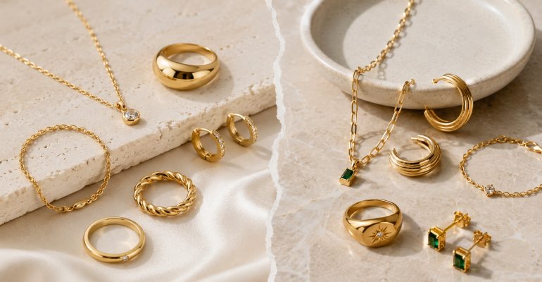
I have a complicated relationship with jewelry that costs more than £50 but less than £500. It’s the category where the promises are largest and the disappointments are most frequent. Demi-fine jewelry — real gold plating over sterling silver, positioned between costume and fine — has been the fastest growing segment in the jewelry market for the last several years. The appeal is obvious. You want pieces that look like fine jewelry without paying fine jewelry prices. The problem is that the category contains brands that genuinely deliver on that proposition and brands that deliver beautiful photographs and mediocre longevity. Mejuri and Missoma are the two names that come up most consistently when people are researching this category. I’ve owned pieces from both for long enough to know what actually happens after the newness wears off. What these brands are and how they got here Mejuri was founded in Toronto in 2013 by Noura Sakkijha, whose family had been in the jewelry business for three generations. The brand launched DTC before DTC was the obvious model for jewelry and built its entire marketing identity around something genuinely different for the industry at the time: the idea of women buying jewelry for themselves rather than waiting for it as a gift. This sounds simple. In the jewelry industry in 2013 it was a meaningful reframe. The marketing consistently showed women wearing their own pieces, buying their own pieces, treating jewelry as a form of self-expression rather than a form of sentiment received from others. The aesthetic that developed from this positioning is minimal in a specific way — not stark minimal, but quietly expensive minimal. Thin bands, simple disc pendants, stud earrings with a single element, layering necklaces with small charms. The pieces are designed to be worn together in a way where the collection accumulates meaning rather than any individual piece trying to be the statement. Missoma was founded in London in 2008 by Marisa Hordern. The brand built its following more gradually, through collaborations (the Harris Reed pieces were particularly significant for bringing the brand to a different audience) and through a consistent presence in the UK fashion media. The aesthetic is slightly more ornate than Mejuri — more visible texture, more shaped elements, more design detail that shows itself rather than receding. Both brands hit the right moment. The demi-fine category expanded significantly during the pandemic years when people were making targeted purchases rather than shopping broadly, and jewelry that delivered a visual luxury hit without fine jewelry pricing captured a lot of that spending. Gold plating quality — the thing that determines everything The central practical question with any gold-plated jewelry is: how long does the plating last? Because gold-plated jewelry will eventually show wear at friction points — clasps, the back of pendants, ring shanks, earring posts. The only questions are when and how visibly. Mejuri uses 18k gold plating on their non-solid-gold pieces. The plating is applied via a process they describe as solid gold bonded, which is different from standard gold plating in thickness. The brand is reasonably transparent about care instructions: store pieces individually, avoid water and chemicals, remove before exercise. Following these instructions makes a meaningful difference to longevity. In practice, my experience with Mejuri’s plated pieces has been one to two years of daily wear before I notice any fading at friction points. Rings, unsurprisingly, show wear faster than necklaces because rings experience more friction. Necklaces with minimal pendants and simple chains hold the plating better than heavily textured or worked pieces. Missoma uses 18k gold vermeil, which is a specific legal designation meaning gold plating over sterling silver at a minimum thickness of 2.5 microns. This matters for two reasons: the sterling silver base is better for metal sensitivities than the brass base many gold-plated pieces use, and the vermeil standard means the plating is thicker than much of what’s sold as “gold-plated” without the vermeil specification. In my experience Missoma’s plating holds similarly to Mejuri’s on comparable pieces. The vermeil standard is meaningful as a base specification but doesn’t translate to dramatically different longevity in practice. What affects longevity most is piece type and care habits — both from both brands. The design languages, which are more different than they look in thumbnails Mejuri’s pieces have a deliberate restraint. If you laid them on a table without context you would describe them as elegant rather than ornate. The brand releases new pieces regularly but within a consistent vocabulary: thin bands, simple geometric elements, chains at various weights. The colorways lean warm gold with some rose gold and a deliberate silver offering. The pieces are designed to layer and to disappear into an overall look rather than demanding individual attention. This is either the point or it’s not enough, depending on what you want from jewelry. Missoma allows more visual presence. Their pieces have elements that announce themselves: a specifically shaped charm, a textured surface, a more visible construction. The collaborations they’ve done — particularly the Harris Reed collection, which introduced more sculptural and androgynous elements into the brand — have pushed the design vocabulary further than their core range. When you’re wearing Missoma, the piece participates in the outfit more actively than Mejuri tends to. Both approaches are valid. The question is whether you want jewelry that integrates or jewelry that punctuates. Solid gold — because it changes the comparison Both brands offer solid 14k gold pieces at prices significantly above their plated offerings. This is worth discussing separately because the considerations are different. Mejuri’s solid gold range is one of the most accessible entries into actual fine jewelry available. A solid 14k gold simple hoop or band sits around £150-350 depending on size and weight. These pieces are not going to show wear the way plated pieces do. They will last indefinitely with basic care. If you’re buying something with the intention of wearing it daily for years or decades, Mejuri’s solid gold pieces represent genuinely good
ASOS vs Nordstrom — Two Very Different Answers to Online Fashion Shopping

Comparing ASOS and Nordstrom is a bit like comparing a street market to a department store. Both sell clothes. Both can get things to your door in a few days. The experience of navigating each, the quality of what you find, the returns process, the reason you’d go to one versus the other — almost nothing about them is actually comparable except the most surface-level fact that both are places where you can buy clothes on the internet. Understanding what each one is for is more useful than the comparison, so let me start there. What ASOS actually is ASOS is a British online retailer that sells an enormous range of fashion at primarily accessible price points. The range includes ASOS’s own label (their cheapest and most trend-responsive products), mid-tier brands (Topshop, which is now an ASOS-owned brand, various contemporary labels), and some premium brands at their real prices. The whole thing exists on a platform that is genuinely well-designed for browsing — the filtering is excellent, the size and fit guidance has improved significantly, and the range is wide enough that you can usually find something in whatever specific combination of style and price you’re looking for. The appeal of ASOS is breadth and speed. They move fast. When a trend appears, ASOS versions of it are available quickly and at prices that don’t require careful consideration. For fashion that you want now, in whatever size you are, ASOS is often the fastest path to something wearable. The limitation of ASOS is quality consistency. The own-label products vary considerably. Something that costs £25 at ASOS costs £25 for a reason, and while some pieces genuinely exceed expectations for the price, others disappoint in ways that a higher price point would predict more reliably. The brand mix on the platform is also uneven — some of the third-party brands sold on ASOS are excellent and some are not, and navigating which is which requires familiarity with the brands rather than trust in ASOS as a curator. What Nordstrom actually is Nordstrom is an American department store with a significant online presence. The product mix spans accessible (BP. their house brand, various mid-tier contemporary labels) to genuinely premium (Theory, Vince, many luxury brands). The curation is more intentional than ASOS’s — Nordstrom makes decisions about which brands to carry and how to present them rather than attempting to carry everything. The thing Nordstrom is genuinely famous for — and has been for decades — is customer service. Free shipping. Free returns. No time limit on returns for most items. The return experience is as frictionless as it gets in retail. This matters for online fashion specifically because fit uncertainty is the primary barrier to buying clothing without trying it on. Nordstrom’s returns policy removes that barrier almost completely. The buying experience at Nordstrom skews toward investment pieces rather than trend pieces. The prices are higher than ASOS across equivalent categories. But what you’re paying for is partly quality and partly the confidence that if it doesn’t work out, the return process won’t be a source of additional frustration. Returns — where the gap is most significant I want to spend time here because for online clothing purchases, the returns experience is arguably more important than the purchase experience. ASOS has a returns process that works but requires engagement. You initiate the return online, print a label or drop off at a collection point, wait for the refund to process. The returns are technically free in many markets. The window is 45 days. It functions, and most people who use ASOS regularly have figured out their local drop-off options and manage it without major frustration. But it’s not invisible the way the best returns processes are. Nordstrom’s returns are different in a way that actually changes how you shop. When returns are genuinely free, genuinely hassle-free, and genuinely no-questions-asked, you buy with more confidence. You order two sizes and return the one that doesn’t fit. You buy something speculative and return it if the color isn’t right in your actual lighting. The returns policy is not just a logistics feature — it’s a shopping freedom feature, and it changes what you’re willing to order. Quality across equivalent price points At equivalent price points, Nordstrom’s own-label pieces (Nordstrom Signature, BP., Caslon) generally outperform ASOS’s own-label pieces in fabric quality and construction. This is a generalization with exceptions — ASOS has pieces that exceed expectations and Nordstrom has pieces that disappoint — but as a general pattern it holds. Where this comparison becomes more complex is in the third-party brand overlap. Both platforms carry some of the same brands — Levi’s, Free People, various contemporary labels. For those brands, you’re buying the same product either way and the decision between ASOS and Nordstrom comes down to price (ASOS sometimes runs better promotions) and returns (Nordstrom is easier). Size range ASOS wins clearly on size inclusivity. Their extended size range is one of the most comprehensive in online fashion retail and it’s been a core brand commitment rather than a belated addition. From the smallest to the largest sizes available, ASOS’s range is genuinely broad and the fashion across the size range is equivalent rather than relegated. Nordstrom has improved on size inclusivity but it’s not their historical strength. The extended size range exists but the fashion across sizes is less consistent. The practical guide Use ASOS for: trend pieces at accessible prices, extended size range shopping, ASOS own-label basics that you’re not planning to keep for years, and fast-fashion purchases where the price makes the lower quality threshold acceptable. Use ASOS for: trend pieces at accessible prices, extended size range shopping, ASOS own-label basics that you’re not planning to keep for years, and fast-fashion purchases where the price makes the lower quality threshold acceptable. Use both: for the brands they share, compare prices. For sizes Nordstrom doesn’t cover well, ASOS. For the best returns experience when spending real money, Nordstrom.
Gymshark vs Lululemon — The Price Gap Is Real. Is the Quality Gap Real Too?
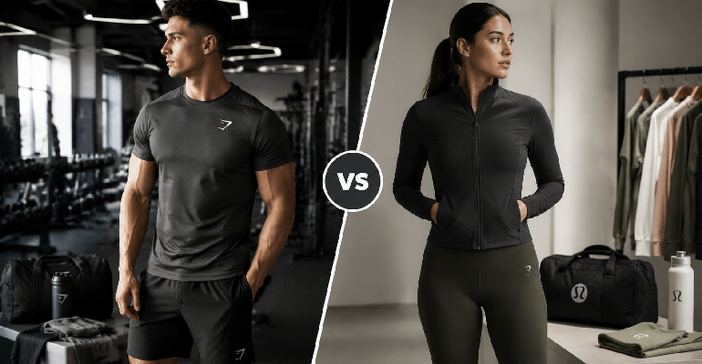
The difference between a Gymshark legging and a Lululemon legging is somewhere between £40 and £70 depending on the specific style. That’s a meaningful amount of money. It’s the kind of difference that makes you want someone to tell you definitively that one is clearly worth it and one clearly isn’t, so you can make the decision and move on. I’m going to tell you that the answer is more complicated than that, but not in the way that usually means the answer is actually simple and I’m just being coy about it. The genuine complication here is that the right answer depends on what you’re buying, what you’re doing in it, and how much the brand story matters to you relative to the physical product. Where these brands are coming from Lululemon is a twenty-six-year-old Canadian company that essentially invented the premium women’s activewear category. The brand has built enough equity and enough genuine product innovation over that period that the premium has something concrete behind it — specific fabrics that took years to develop, a design philosophy that has remained coherent through significant growth, and a quality guarantee that exists because the company genuinely expects its products to last. Gymshark is a twelve-year-old British company that built its entire initial growth through social media and fitness influencer partnerships before that was a standard playbook. The brand was founded by Ben Francis in his parents’ garage in Birmingham and scaled to a billion-pound valuation through a specific combination of community-building and accessible pricing. The brand has an authenticity to its origin that Lululemon’s more corporate scale doesn’t replicate, and it resonates particularly strongly with the fitness community it was built within. These different origin stories produce different products. Fabric — the single most important comparison Lululemon’s Nulu fabric is the thing most people mean when they say Lululemon justifies its price. There is no comparable fabric in Gymshark’s range. Nulu is a proprietary development that delivers a combination of softness, weight, and shape retention that other brands — including Gymshark — haven’t matched. For yoga, Pilates, barre, and any movement where maximum skin comfort is what you want from the fabric, there is no Gymshark equivalent. Gymshark’s Seamless fabric is a different product doing a different job. It has a textured surface quality, a comfortable fit, and better-than-expected durability. It’s not trying to be Nulu. It’s trying to be good activewear at an accessible price and it succeeds at that. The Vital Seamless legging in particular is one of the most consistently well-reviewed affordable activewear products available, and the review consensus is that it performs above its price point. The Gymshark Adapt collection, with its more structured compression fabrics, performs well for high-intensity training. This is actually a category where the comparison between Gymshark and Lululemon is closer — Lululemon’s equivalent training pieces (the Wunder Train, the Fast and Free) use fabrics that are more about performance than comfort, and Gymshark’s competition-level pieces are closer to this territory than they are to the Nulu category. Durability — what happens after twenty washes Lululemon pieces that are well cared for genuinely last. The Align I’ve had for three years looks marginally different from when it was new — the Nulu has softened slightly further, which is actually pleasant — but it’s structurally intact, the waistband hasn’t stretched, and there’s no significant pilling. Gymshark’s durability is reasonable but not in the same category. After a year of regular washing, the Vital Seamless shows slight pilling at the inner thigh. Not dramatic. Not unwearable. But visible in a way the Lululemon equivalent hasn’t shown. This is a fair comparison because the Gymshark is half the price — the longevity question is always relevant to the total cost of ownership. If a Gymshark legging lasts eighteen months of regular use and a Lululemon lasts three years, the per-wear cost narrows the apparent price gap. Sizing and fit Gymshark has historically sized for a specific body type and been criticized for it. The brand has expanded its size range and improved the fit documentation on their website, but if you’re outside the mid-range of sizes, Gymshark can be less reliable than Lululemon for fit accuracy. Lululemon’s sizing is inconsistent across product lines — this is a known issue and a reasonable frustration — but their customer service for fit issues is responsive and the size range is broader than Gymshark’s. The community and identity dimension I want to mention this without overstating it. Both brands have built real communities. Gymshark’s is younger, more fitness-competition oriented, more tied to social media culture. Lululemon’s is more established, more yoga-and-wellness oriented, and embedded into a broader lifestyle identity. Neither of these is a reason to buy or avoid either brand. But for some people, which community they want to be associated with is part of the purchasing decision, and I’d rather acknowledge that than pretend buying activewear is a purely functional decision for everyone. The actual recommendation Buy Gymshark if: you’re primarily doing higher-intensity training, you’re budget-conscious and want solid performance activewear at a lower price point, you’re newer to the premium activewear category and want to test whether the investment is worthwhile before spending more, or you specifically like the Gymshark aesthetic and community identity. Buy Lululemon if: the Nulu fabric is specifically what you want (nothing else does what Nulu does), you’re buying primarily for yoga or Pilates, you want the quality guarantee and the longer expected lifespan, or you’re buying for a use case where maximum fabric comfort matters more than maximum performance. The conclusion worth landing on: Gymshark is not a compromise brand. It’s a genuinely good activewear brand at accessible prices. Lululemon is not just a brand you pay for the name. It has specific products — primarily the Nulu collection — that deliver something no one else quite replicates. Knowing which product justifies which price is what actually matters.
IKEA vs Wayfair — I’ve Bought from Both More Times Than I’d Like to Admit
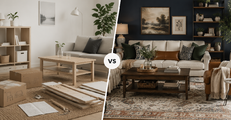
There’s a specific kind of furniture purchase that most people make at some point — probably more than once — where the primary constraint is that you need something that looks decent, fits the space, and doesn’t cost what a sofa should actually cost if furniture was priced honestly. IKEA and Wayfair both live in this territory. They both have thousands of options at accessible prices. They’re also completely different operations doing completely different things, and treating them as equivalent produces predictable disappointment. Let me tell you what I’ve learned from furnishing multiple spaces with products from both. What IKEA is and how it works IKEA is a vertically integrated manufacturer. They design the products, they have significant influence over how they’re made, they ship them flat-packed to their own warehouses, and they sell them in their own stores (and increasingly online) at prices that reflect the efficiency of this model. The IKEA Billy bookcase is cheap because IKEA has manufactured millions of Billy bookcases and refined every element of its production to reduce cost while maintaining function. The implications of this: IKEA quality is consistent. Not always high — some IKEA products are not well-made and everyone who has used IKEA knows which categories to approach carefully — but consistent. A Billy bookcase from 2026 is built to the same specification as a Billy bookcase from 2010. You can look up reviews from any year and they describe the same product. IKEA design is also consistent in a specific way. The aesthetic is Scandinavian minimalism that has become so widely imitated that it’s now just described as “modern.” Clean lines, functional design, limited ornamentation. This either fits your aesthetic or it doesn’t. If it does, IKEA’s range covers an enormous variety of storage, seating, bedroom, and kitchen furniture at prices that are hard to argue with. What Wayfair is and how it actually works Wayfair is a marketplace. They don’t manufacture anything. They host products from thousands of suppliers — most of them in China, Vietnam, India, and parts of Eastern Europe — and sell those products under a collection of Wayfair house brand names: Andover Mills, Kelly Clarkson Home, Mercury Row, Laurel Foundry Modern Farmhouse. These aren’t different companies. They’re labels applied to products from different manufacturers. The implications of this: Wayfair quality is wildly inconsistent. A rug from one supplier and a bookshelf from another supplier are essentially unrelated products that happen to be listed on the same website. The 4.3-star rating on a sofa and the 4.3-star rating on a dining table come from two completely different manufacturing sources with two completely different quality floors. This is the most important thing to understand about Wayfair and the thing that causes the most disappointment for people who treat it like a conventional retailer. You cannot transfer your trust in one Wayfair product to another Wayfair product the way you can with IKEA. The quality question — what you’re actually getting at similar prices At the £100-300 price point that covers most IKEA furniture and a significant chunk of Wayfair’s mid-range: IKEA is more predictable. The quality will be what the reviews say it is. The dimensions will be accurate. The assembly instructions, while sometimes infuriating, are consistent with the product. At this price point on Wayfair: you can find genuinely excellent products that exceed IKEA’s quality by some margin, and you can find genuinely terrible products that represent poor value even at low prices. The mechanism for telling which you’re looking at before buying is: reading every negative review, looking at customer-uploaded photos rather than product photos, and filtering by most recent reviews rather than aggregate rating. At the £500-1,500 price point: Wayfair’s range includes products that IKEA simply doesn’t offer — specific styles, specific proportions, specific aesthetics that the IKEA range doesn’t accommodate. For a sectional sofa in a specific configuration, a bed frame in a specific style, or a dining table in a specific material that IKEA doesn’t make, Wayfair’s breadth is its genuine advantage. Assembly — what it’s actually like IKEA assembly has become a cultural shorthand for furniture frustration, but IKEA’s instructions are actually quite good by flat-pack standards. Visual step-by-step diagrams, hardware sorted by step, consistent screw and dowel sizing within a product. Most IKEA assembly, done without rushing, goes well. The pieces fit because the tolerances are designed by the same company that designed the furniture. Wayfair assembly varies by manufacturer and is sometimes genuinely poor. Instructions that reference the wrong step, hardware bags that don’t correspond to the labeling in the instructions, pieces that don’t align in the way the instructions suggest because the tolerances from the actual manufacturer aren’t what the generic instructions describe. When Wayfair assembly goes wrong it goes wrong in ways that feel like a problem with the product rather than user error, because sometimes it is. Returns — the thing that matters enormously for furniture IKEA has a 365-day return policy for most products, and returns to their stores are simple. If you’ve assembled it and it doesn’t work, you can disassemble and return within the policy window. The in-store return process is functional if occasionally queue-based. Wayfair’s return policy for large furniture items requires you to organize and pay for return shipping in most cases. A sofa that arrived in a van and needs to be collected by a van to be returned is not a frictionless return. The cost of returning large Wayfair furniture can be substantial — sometimes exceeding the cost of the furniture itself for very large pieces. This is the most significant consumer protection concern with Wayfair and it gets buried in the shopping experience. Understanding this before buying large Wayfair items is not optional. Know what return means for the specific item you’re purchasing before you add it to cart. The practical guide by furniture type Bedroom storage, bookshelves, simple shelving: IKEA. The PAX wardrobe system and the KALLAX shelving are among the best value products in furniture
Charlotte Tilbury vs MAC — Two Professional Makeup Brands, Two Completely Different Experiences
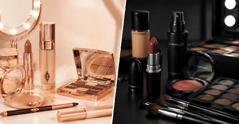
I’ve been wearing makeup long enough to have gone through phases with both of these brands. The MAC phase in my early twenties when a Studio Fix foundation was the answer to every skin question I had. The Charlotte Tilbury phase that started when someone handed me a sample of Flawless Filter and I immediately understood what the fuss was about. They’re both professional-quality brands. They’re both expensive. They’re both genuinely good at what they do. But they’re designed for different people with different relationships with makeup, and choosing the wrong one for your priorities is how you end up with a beautiful product that sits in a drawer. The philosophies behind the brands MAC was founded in Toronto in 1984 by Frank Toskan and Frank Angelo. The brand’s origin was professional — it was created for photographers and makeup artists who needed products that performed under lights and cameras. The professional heritage is embedded in the product philosophy: formulations designed for maximum performance, wide shade ranges that cover genuine skin diversity, and a product line structured around the technical requirements of makeup artistry rather than the aspirational lifestyle marketing that most beauty brands lead with. Charlotte Tilbury launched in 2013 after its founder had spent decades as a celebrity makeup artist whose client list was as impressive as anyone in the industry. The brand philosophy is overtly glamorous — every product is named after a look or an idea, the packaging is a specific shade of rose gold that’s immediately identifiable, and the whole experience is built around the aspiration of looking like someone who knows the secrets that a high-end makeup artist knows. Charlotte Tilbury’s marketing is some of the best in beauty because Tilbury herself is a genuinely charismatic presence who communicates not just what the products do but how they’re supposed to make you feel. These different origins produce genuinely different products. Foundation — the category where the comparison is most instructive MAC’s Studio Fix line is one of the most reliably reviewed foundations in professional makeup. The coverage is buildable from medium to full, the shade range is one of the most comprehensive available, and the formula holds up under conditions — photography, events, long days — in a way that reflects the professional origin. The finish is matte, which is right for some skin types and wrong for others, and there are enough variations within the MAC foundation range (Face and Body for sheerer coverage, Pro Longwear for maximum durability, Studio Radiance for more glow) that most skin types find a version that works. Charlotte Tilbury’s Beautiful Skin Foundation is a different product doing a different thing. The coverage is lighter — medium buildable, not full coverage without layering. The finish is radiant in a way that reads as skin rather than makeup, which is the specific effect Charlotte Tilbury has spent her career creating for clients. The shade range has improved significantly since launch but is still narrower than MAC’s. The honest comparison: MAC for full coverage performance, durability under challenging conditions, and the widest shade range. Charlotte Tilbury for a luminous, skin-like finish that looks like very good skin rather than very good coverage. Complexion products — Flawless Filter deserves its own conversation Charlotte Tilbury’s Flawless Filter is the product that most clearly represents what the brand does that MAC doesn’t. It’s a primer, filter, and light coverage product that can be worn alone or under foundation. The effect is a specific kind of radiance — a lit-from-within glow that doesn’t read as shimmer or highlight but as skin that’s genuinely healthy and rested. There is no direct MAC equivalent to Flawless Filter. MAC makes excellent primers and highlighters but they’re not trying to do what Flawless Filter does. For the specific effect of looking like you’ve slept well and have good skin even when you haven’t and don’t, Flawless Filter is the product. This is not a comparison where MAC wins on the same terms — they’re not trying for the same result. Lipstick — where both brands are genuinely excellent MAC’s lipstick range is legendary and deservedly so. The Matte collection covers an enormous range of shades with a formula that’s consistent across colors and delivers the coverage and staying power that the professional heritage suggests. MAC’s Ruby Woo remains one of the most reliably perfect blue-red matte lipsticks available despite being decades old. Charlotte Tilbury’s Matte Revolution lipstick is genuinely excellent in a different way — the formula is more comfortable on the lips than MAC’s matte, trading some of the maximum coverage for wearability, and the shade selection is curated rather than comprehensive. The Pillow Talk family of shades has become iconic in a way that’s genuinely earned — it photographs beautifully on an extraordinary range of skin tones and lip shapes. Price comparison MAC is slightly more accessible than Charlotte Tilbury across comparable products. Foundation at MAC runs £27-35. Charlotte Tilbury runs £34-42. Lipstick at MAC: £19-22. Charlotte Tilbury: £27-32. Both brands are genuinely premium. Neither is cheap. But if budget within the premium tier is a consideration, MAC typically offers slightly more product for the money. Honest recommendation Buy MAC if: shade range is a priority (particularly for darker skin tones where Charlotte Tilbury’s range, though improved, is still not MAC’s equal), you want maximum performance and coverage, you’re interested in professional makeup techniques, or you want the widest possible selection within a category. Buy Charlotte Tilbury if: the luminous skin-like finish is the effect you want, you specifically want the Flawless Filter experience, you prioritize the overall brand experience and aesthetic, or you’re shopping for something that will photograph particularly beautifully. Use both: MAC for workhorse products where performance is the primary requirement, Charlotte Tilbury for the specific products it does better than anyone else.