
How to Shop Wayfair Without Getting Burned — Specific Strategies That Work

Wayfair is genuinely useful and genuinely dangerous simultaneously, which is an unusual position for a furniture retailer to occupy. The range is extraordinary — if you need a specific piece of furniture in a specific size at a specific price, Wayfair almost certainly has it. The quality is wildly inconsistent in ways that make the same trust you’d extend to a conventional retailer completely inappropriate here. Understanding what Wayfair actually is — a marketplace hosting thousands of suppliers, not a manufacturer with consistent quality standards — is the foundation of shopping it well. Once you internalize that every product on Wayfair is from a different manufacturer with different quality standards, and that Wayfair exercises limited direct control over those standards, you start approaching individual purchases with appropriate skepticism rather than brand-level trust. Read the reviews correctly — not just the star rating The aggregate star rating on Wayfair is one of the least reliable single pieces of information on the page. The distribution of reviews matters more than the average. A product with a 4.3-star rating and 800 reviews might have 600 five-star reviews and 150 one-star reviews with nothing in between. This bimodal distribution means the product either worked or catastrophically didn’t, which tells you something specific about the failure mode — likely a quality control issue that produces some excellent units and some defective ones rather than a consistently mediocre product. Read the one-star and two-star reviews specifically and look for patterns. If fifteen negative reviews all mention the same specific problem (drawers don’t close properly, the color is dramatically different from the photo, the hardware stripped out immediately), that’s a reliable product-level issue rather than isolated user error. If the negative reviews are scattered and contradictory (some say too light, some say too dark; some say too large, some say too small), the product is probably fine and the reviews reflect individual mismatches rather than product defects. Customer photos over product photos — always The professional product photography on Wayfair is optimized to make things look as good as possible under controlled lighting conditions. The customer photos uploaded in the review section show the product in actual homes under actual lighting conditions. For rugs: the color difference between product photography and customer photos is frequently significant — warm tones photograph as cooler, what reads as ivory online often arrives as cream or even light beige in person. Look specifically for customer photos in rooms with similar flooring and lighting to yours. For furniture: customer photos reveal the actual quality of the finish, the real-world proportions (a sofa that looks generous in an empty white studio looks very different in a furnished room), and the construction quality in ways that product photography never shows. A dresser that looks solid in product photography and appears in a customer photo to have visible gaps at the drawer joints tells you something important. The return policy reality — know before you buy For smaller items (under a certain weight and size threshold), Wayfair’s returns are genuinely straightforward. For large furniture items — sofas, dressers, bed frames, large shelving units — the return process is genuinely complicated and potentially expensive. Large item returns on Wayfair typically require you to arrange and pay for return shipping, which for a sofa can cost hundreds of dollars — sometimes approaching or exceeding the purchase price of the item. Before buying any large piece of furniture on Wayfair, understand the specific return policy for that item and calculate the potential cost of returning it if it arrives wrong. The alternative strategy: use Wayfair for large furniture only when you’re confident (multiple detailed reviews, customer photos that closely match your expectations, measurements triple-checked against your space). Use Wayfair for smaller accessories, decorative items, and rugs where the stakes of a return are lower and the process is simpler. Way Day and sale timing — how to save meaningfully Way Day is Wayfair’s annual two-day sale event (typically in April or May) and it represents genuine discounts on already-reasonably-priced items. Unlike some retailers that inflate prices before sales, Wayfair’s sale pricing during Way Day represents real reductions from prices that have been tracked for weeks before the event. The strategy for Way Day: add items to your wishlist in the weeks before the event, screenshot or note the current prices, and verify during Way Day that the “sale” price is actually lower than the pre-sale price you tracked. Most items do get genuine discounts. A small percentage see artificial price inflation before the sale. Outside of Way Day: the Labor Day, Memorial Day, and Black Friday events offer comparable deals on furniture specifically. Rugs go on sale more frequently. Bedding and bath items go on sale most consistently.
How to Wear Color If You Always Wear Black

There’s a version of this article that tells you wearing black all the time is boring and you need to branch out immediately. This isn’t that version. If black works for you — if you reach for it naturally, if it suits your complexion, if it makes getting dressed easier — black is a valid wardrobe philosophy that doesn’t need fixing. What this is for: people who want to add color but find that every attempt feels like a costume. Who buy the camel coat or the sage green blouse and then never reach for it. Who feel like themselves in black and like they’re pretending when wearing anything else. The problem is almost never the color itself. It’s the approach. Why color feels wrong on people who usually wear black Color feels like a costume when it’s introduced all at once or in the wrong proportion. An outfit that’s 80% color when your wardrobe is 100% black feels like you’ve accidentally walked into someone else’s clothes. The disconnect is real and produces a self-consciousness that makes the outfit feel wrong even when it looks fine. The fix is gradual introduction in low-stakes positions — starting with color where it’s least visible and most supported by the black that still dominates your silhouette. The order of introduction that actually works Start with accessories. A colored bag, a scarf, a pair of shoes in a color — these sit in an outfit that’s otherwise your normal wardrobe and allow you to see how the color reads without committing to a color piece as a primary garment. A camel bag with an all-black outfit. A burgundy loafer with dark jeans and a black turtleneck. The color is present but supported. Move to bottom pieces next. Trousers and skirts in non-black neutrals — camel, navy, dark olive, burgundy — worn with black tops. This introduces color at a lower visual profile than a top or dress while providing more presence than an accessory. Dark olive wide-leg trousers with a black silk blouse is a complete, considered outfit where the color is present but not overwhelming. Top pieces last. A colored shirt or blouse is the highest-visibility introduction of color because it’s closest to the face and most prominent in the silhouette. Starting here is why color introductions feel costume-like — the color competes with everything else in the outfit for visual attention. The colors that work best as an entry point from black Colors that sit close to black in tone — deep burgundy, dark olive, dark navy — feel most natural in a predominantly black wardrobe because the tonal relationship is close enough to maintain the overall feel while introducing color variation. These aren’t compromises; they’re genuinely sophisticated choices that work both as introductions and as permanent wardrobe additions. Colors that work well against black specifically — camel, cream, terracotta, dusty pink, sage green — provide contrast without the harsh brightness of primary colors. These work naturally in the black-plus-one-color outfit formula that’s both visually clean and easy to repeat across multiple garment combinations. The one color principle The outfit formula that removes the complexity of mixing colors: one color, everything else black or white. A camel coat, black trousers, black shoes, black bag. A sage green dress, black boots, black bag. The color reads as intentional and the outfit is coherent without requiring an understanding of color theory or a willingness to mix multiple non-neutrals. This formula removes the costume problem because the color is contextualized by the familiar blacks and whites. It reads as a considered color choice rather than a departure from self.
Robot Vacuums — Honest Reviews After Months of Real Testing
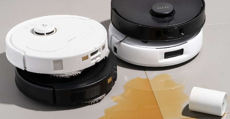
The robot vacuum category has a reputation problem. Early robot vacuums were legitimately not very good — they bumped into furniture randomly, missed corners systematically, and needed rescuing from under couches with an embarrassing frequency. That reputation has persisted long past the technology that caused it. The current generation of robot vacuums — the ones worth buying — are genuinely different products. The category also has a feature inflation problem. Every product adds features — auto-empty bases, mop attachments, object avoidance, room mapping — and the marketing creates the impression that the most feature-rich product is the best one. This is not reliably true. The right robot vacuum is the one that does the basic job reliably in your specific home, and additional features are only valuable when they add to that reliability rather than to the product’s specification sheet. Roborock S8 Pro Ultra — the best all-around for most homes The Roborock S8 Pro Ultra costs around $1,600 and is the product I’d recommend to someone who wants a robot vacuum that works as close to autonomously as currently possible. The auto-empty base charges the robot, empties the dustbin automatically, cleans the mop pads automatically, and refills the water tank for mopping automatically. The practical consequence is that your interaction with this robot is primarily scheduling it via the app and occasionally emptying the large dust bag from the base. The suction power (6,000Pa) handles carpet and hardwood floors reliably. The obstacle avoidance (Roborock calls their system ReactiveAI 2.0) handles cables, small objects, pet toys, and shoes with considerably more competence than first-generation systems. It still gets confused by certain edge cases but the frequency is dramatically lower than older robots. The mopping function is genuinely useful for hard floors — not a deep clean, but a maintenance mop that keeps floors clean between thorough manual cleaning. The auto-cleaning of mop pads is the feature that makes this useful rather than a gimmick — a dirty mop pad spread dirty water across your floor is worse than not mopping, and systems that require manual pad washing largely defeat the purpose. iRobot Roomba j7+ — the best for homes with obstacles The Roomba j7+ costs around $600-700 and is the recommendation for homes with cables on the floor, pet accidents, or small objects that robot vacuums typically fail on. iRobot’s proprietary PrecisionVision Navigation identifies and avoids specific categories of objects — cables, socks, pet waste (yes, specifically pet waste, following the disaster reviews of older Roombas spreading accidents across floors) — with an accuracy that other brands haven’t fully matched. The j7+ includes an auto-empty base that holds 60 days of dirt. The cleaning performance is excellent on hardwood and good on carpet. The mapping and navigation are reliable enough to schedule confidently for specific rooms at specific times. The honest limitation compared to Roborock: no mopping function, and the suction power (not published explicitly by iRobot but tested as competitive with mid-range Roborock models) is lower than the S8 Pro. For homes with carpet primarily, this matters less. For homes with primarily hard floors where mopping capability would be useful, Roborock is the better platform. Eufy RoboVac X8 — the honest value option The Eufy RoboVac X8 costs around $300-350 and represents what the value segment of the robot vacuum category looks like when it’s done well. The twin turbine design produces strong suction (2,000Pa) that handles hard floors and light carpet reliably. The navigation is laser-based (LiDAR) rather than camera-based, which produces reliable mapping without the object avoidance sophistication of the Roomba j7+. For a home with relatively clear floors (few cables, no pets, minimal small-object obstacles), the Eufy X8 at $300 produces results that compare favorably with robots at twice the price because the core function — vacuuming — is done well. The limitations appear in the specifics: no auto-empty base (you empty the dustbin manually after each run), no mopping, and less reliable obstacle avoidance. What robot vacuums are not replacing A robot vacuum is maintenance cleaning — keeping floors from accumulating dust, pet hair, and debris between thorough manual vacuum sessions. It is not a replacement for a thorough vacuum that goes under furniture, into corners with real suction, or on stairs. The expectation that a robot vacuum eliminates manual vacuuming is the primary source of disappointment in this category. It doesn’t. It reduces how often you need to manually vacuum, which in a home with pets or high traffic is a meaningful and genuine improvement to the cleaning workload. Carpet deep cleaning — the embedded dirt and allergen removal that requires a full-size vacuum with powered brushes — also requires a non-robot vacuum. The robot maintains the surface between full cleans; it doesn’t perform the full cleans.
Ruggable Review — Over a Year of Real Testing, Honest Verdict
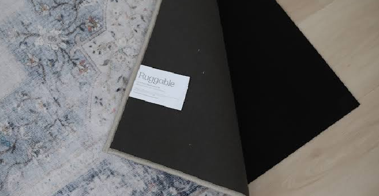
The Ruggable promise is simple and specific: a rug you can wash in your home washing machine when something happens to it. If you have a dog, children, a clumsy household, or if you simply live in a home where rugs experience things that rugs experience — this promise is immediately appealing. Whether it’s a promise the product actually keeps at full scale is what this review is actually about. I’ve had a Ruggable rug in the most high-traffic, highest-risk room in my home — the living room, with a large dog who comes in from outside — for over fourteen months. I’ve washed it nine times. Here is what I actually know. How the system works and why it matters Ruggable is a two-piece system. There’s a rug pad that stays on the floor permanently — it’s grippy on the bottom and has a cling surface on top that holds the rug cover in place. Then there’s the cover, which is the decorative part you see and the part that goes into the washing machine. You detach the cover from the pad, wash it, put it back. The first time you detach the cover, the noise it makes — a kind of velcro-ish separation sound — is slightly alarming if you’re not expecting it. The attachment is strong enough to prevent any casual shifting during use but releases when you deliberately pull it. Reinstalling the cover after washing involves laying it over the pad and smoothing it from the center out. On the 5×8 size, this is a two-person job done more easily than a one-person job. On smaller sizes it’s fine alone. On larger sizes (8×10 and above) it’s significantly easier with two people. This is a realistic thing to know before buying a large format. The washing — what actually happens Cold water, delicate cycle, standard detergent. These are the Ruggable instructions and I’ve followed them consistently. The 5×8 fits into my standard front-loading washing machine — I checked the drum capacity before buying (Ruggable provides specific drum size guidance and it’s worth checking because a 5×8 is at the limit of most standard machines). What happens in the wash: the colors have not faded noticeably across nine wash cycles. The pile has softened from its original state — not degraded, softened, which actually feels like an improvement. The backing shows no deterioration. The edges are clean with no fraying or unraveling. The honest observation about what happens over the long term: after nine washes, the surface has a slightly more relaxed texture than when new. If you’re expecting the rug to look perpetually brand-new after repeated washing, it won’t. It will look like a well-used, well-maintained rug that has aged in a normal way. Performance under actual dog conditions My dog is a large retriever who comes inside after running in the garden, which means mud in winter, damp paws in autumn, and occasional food theft from the kitchen that results in a running return to the living room. The Ruggable has absorbed all of this and been washed clean of all of it. The specific events that would have ruined a non-washable rug: one red wine spill (washed clean, no visible stain remaining), one mud incident following rain that left visible brown marks across a significant portion of the rug (washed clean), one food-related incident that I’d rather not describe in full detail (also washed clean). This is what Ruggable is for. The peace of mind of knowing that whatever happens can be cleaned — not reduced to better, not treated with expensive cleaning products and partial results, but actually cleaned in a washing machine — is the genuine value proposition and it’s real. Design range — what’s actually available Ruggable’s design range has expanded significantly from its early years. The early catalogue was heavy on traditional Persian-style patterns and basic geometric designs. The current range includes collaborations with designers and artists, solid colors in contemporary shades, boucle textures (which photograph beautifully), and more interesting pattern vocabulary. The Mercer collection — traditional medallion patterns in neutral colorways — remains the most popular and for good reason: the pattern complexity hides texture variation after washing better than a solid-color rug, the colorways are genuinely neutral in a way that works with most furniture, and the designs photograph well. The solid color rugs are the honest trade-off: they look clean and contemporary when new, and they show texture variation from washing more visibly than patterned rugs. Not damaged, but different. If you want a solid-color Ruggable, buying a slightly busier solid (a subtle texture rather than a completely smooth surface) compensates for this. The verdict on whether it’s worth the price Ruggable rugs cost more than comparable conventional rugs at most size points. The 5×8 Mercer I bought was around $230 at full price (Ruggable runs sales frequently). A conventional rug of similar pattern complexity and quality would run $150-200. The Ruggable premium is specifically for the washing system. If the washing system is relevant to your life — pets, children, active household — the premium is straightforwardly justified. If your household doesn’t produce rug events that require more than vacuuming, the conventional rug at a lower price is the rational choice. I will continue buying Ruggable for any room my dog uses. For other rooms, I might make different decisions. This is the correct framework for thinking about whether Ruggable is right for you: not whether it’s a good rug, but whether the washability is worth the premium given what your household does to rugs.
Kitchen Organization Ideas That Actually Work — No Influencer Fluff
Kitchen organization content on social media is almost entirely aspirational fantasy. The pantries that are decanted into uniform labeled containers, organized by color, with every item visible and perfectly proportioned, exist primarily on TikTok and belong to people whose relationship with their kitchen pantry is as performance rather than as the place where they actually keep food. Real kitchen organization has one goal: reducing friction. Making the things you use most accessible and the things you use least out of the way. Minimizing the time between “I want to cook” and “I am cooking.” Everything that serves that goal is worth doing. Everything that doesn’t serve it is theater. The counter space problem — what’s actually causing it Counter space is eaten primarily by three categories of objects: appliances used infrequently stored where frequently used appliances should be, objects that arrived on the counter and never moved, and things waiting to be used that would be better stored somewhere else. The exercise that solves this: for two weeks, don’t put anything away — just move things that go unused into a box. At the end of two weeks, see what’s in the box. Those items don’t belong on the counter. The things that are still out — the items you reached for and used during those two weeks — are the things that deserve counter space. Most kitchens have three to four appliances on the counter that should be in a cabinet (the panini press used twice a year, the juicer that’s been there since January, the second coffee maker from a gift that duplicates the one you already use). Moving these to a cabinet immediately recovers significant counter space without buying anything. Inside the cabinets — what actually helps Pan organization is the problem that has more solutions than any other kitchen storage challenge and fewer good ones than the number of solutions would suggest. The magnetic pan rack that Caraway includes with their set is the best consumer product in this category — it allows pans to be stored vertically, accessible individually without moving others, on a countertop. For people who don’t want a countertop rack, a vertical pan organizer that sits inside a cabinet (around $15-25 on Amazon, the Lynk Professional Roll-Out Cabinet Organizer is the one with consistent reviews) does the same job inside a cabinet. Drawer dividers for utensil drawers — the kitchen utensil drawer that everyone has where everything tumbles together and finding the peeler involves moving six wooden spoons — are worth the $15-20 they cost. The OXO Good Grips Drawer Organizer allows customizable divider placement. The drawer goes from frustrating to functional in fifteen minutes. Shelf risers inside cabinets. The space between cabinet shelves is usually taller than necessary for any single item, which means either stacking (unstable, items at the bottom are inaccessible without moving everything above) or wasted space. A shelf riser — essentially a small shelf that sits inside the cabinet, doubles the usable levels within the same cabinet height — costs $15-25 and immediately doubles the storage capacity of any cabinet where stacking was the previous strategy. The lazy Susan inside a corner cabinet or deep cabinet. Anything at the back of a cabinet that you can’t see or reach doesn’t exist for cooking purposes. A lazy Susan brings the back of the cabinet to the front with a single spin, making items accessible that would otherwise be unreachable without removing everything in front. The pantry decanting conversation — honest version Decanting pantry staples into clear, labeled containers looks organized and has legitimate practical benefits for specific items. Flour and sugar in airtight containers stay fresher longer and take up a consistent, predictable shape. Cereals in airtight containers don’t go stale. Coffee in an airtight container stays fresher than in its bag after opening. The honest version of this: you don’t need to decant everything. Rice that you go through in two weeks doesn’t need to be in a special container — it’s fine in the bag. The bag of almonds you eat from directly doesn’t need a container. The spice that you use occasionally doesn’t need to be in a matching uniform jar with a label. Decant the things where the airtight storage provides genuine benefit (flour, sugar, coffee, cereals, pasta, loose grains). Leave everything else in its original packaging. The aspiration to have every pantry item in matching containers is an aesthetic one, not a functional one, and aesthetic aspirations that require constant maintenance (the refilling, the labeling, the reorganizing when something doesn’t fit) often produce more work than they eliminate. The refrigerator — what actually keeps it organized Refrigerator organization has the same friction-reduction goal as the rest of kitchen organization. The fridge that stays organized is the fridge where the most frequently accessed items are at eye level, raw meat is stored on the lowest shelf (to prevent contamination drips onto food below), and leftovers are in clear containers so they’re visible rather than forgotten. Clear containers for leftovers are genuinely worth buying. Opaque containers mean food gets forgotten, discovered a week later, and wasted. Clear containers mean you see what’s there every time you open the fridge. The Pyrex Simply Store set is the reference — glass, clear, oven-safe, stackable, dishwasher safe. Around $25-35 for a set of ten. A lazy Susan inside the fridge — specifically on the condiment shelf or wherever jars accumulate — produces the same benefit as a cabinet lazy Susan: items at the back become accessible. A small turntable from IKEA ($5-10) does this effectively. The produce drawer problem: most produce drawer use is poor because the humidity setting is either unknown or wrong. The low-humidity drawer (often labeled “crisper”) is for fruits. The high-humidity drawer is for leafy vegetables. Fruits produce ethylene gas that accelerates ripening/spoiling in vegetables if stored together, which is why the drawers exist and why the separation matters.
Handbags Worth Buying — That Aren’t From Designer Brands

Designer bags have a specific appeal that isn’t primarily about quality. The logo, the cultural signaling, the resale value, the aspiration — these are the things people are actually buying when they spend $3,000 on a Saint Laurent tote. The leather is good. The construction is good. But the leather and construction at a fraction of the price from brands without the brand premium are also genuinely good and in some cases better. What follows is an honest list of handbags worth buying in 2026 for people who want quality that lasts and looks expensive without the designer price. The Polène Numero Un — the structured bag that belongs in this conversation Polène is a French brand that launched in 2016 and has built a significant following primarily through the quality-to-price argument. The Numero Un (around $300) is a structured tote in their Peau de Blee leather — a matte, slightly textured finish that reads as premium without the obvious sheen of patent leather or the obvious grain of most mass-market bags. The construction is where Polène separates from alternatives at similar prices. The stitching is clean and consistent. The hardware is substantial in weight and finish in a way that cheap bags immediately reveal themselves not to be. The zipper operates smoothly and the lining is quality rather than the thin polyester that constitutes an interior in many bags at three times the price. The color range is deliberately restrained — Polène produces limited seasonal colors alongside permanent neutrals. The neutrals (the camel, the beige, the taupe) are the correct choice for a bag that needs to work across seasons and outfit contexts. A bag in a strong seasonal color is a fashion purchase; a bag in a quality neutral is a wardrobe investment. After two years of regular use, Polène bags look essentially the same as when purchased with basic care. This is the durability test that fast fashion bags specifically fail. Strathberry — the Scottish brand most people haven’t discovered yet Strathberry is a Scottish leather goods brand whose East/West mini tote has become something of a cult object among people who know it and a genuine surprise to most who don’t. The bag (around $400-500) is made in Spain from full-grain leather with a distinctive bar closure hardware that’s become identifiable enough to read as recognizable without being a logo in the traditional sense. The East/West is proportionally excellent — the long, shallow silhouette in a mid-size version works as a crossbody or top-handle bag, holds a day’s essentials without becoming unwieldy, and photographs beautifully in the way that proportionally considered bags do. The interior is clean, the stitching is impeccable at close inspection, and the leather ages gracefully in a way that lower-quality leather doesn’t. Strathberry bags also benefit from a genuine quality assurance that isn’t just marketing — they repair bags purchased from them, supply replacement hardware, and have a customer service reputation that reflects a brand built on quality rather than volume. Cuyana Classic Zip Tote — the everyday bag done correctly Cuyana is an American brand built explicitly around the “fewer, better things” concept and their Classic Zip Tote ($250-275) reflects this philosophy in a specific way: it’s a well-made, properly proportioned tote designed to work as an everyday bag for years rather than seasons. The Argentinian leather is full-grain, the interior is organized with a zipper pocket and card slots, and the tote is large enough for a laptop, lunch, and everyday essentials without being the oversized, shapeless volume bag that office totes often become. The shoulder drop is calibrated to be comfortable for daily commuting use. The honest comparison to designer totes at double or triple the price: the Cuyana leather is comparable in quality to what you’d find in entry-level designer bags. The construction is clean. The difference is brand story and logo, which are real considerations for some buyers and irrelevant for others. What to look for in any handbag — the quality signals Full-grain leather versus bonded leather. Full-grain is the outer layer of the hide, the most durable part, and it develops a patina with use. Bonded leather is reconstituted leather scraps, ages poorly, and peels rather than developing character. Check the label. Hardware weight. Lightweight hardware feels insubstantial in a way that becomes apparent quickly and signals quality-cutting in the construction process. Substantial hardware — zippers that glide rather than stick, clasps that have real resistance, rings that don’t bend under the weight of a full bag — is a reliable quality indicator. Stitching consistency. Irregular stitching — varying stitch length, thread that pulls or puckers — indicates inconsistent manufacturing standards. Run your hand along exterior seams before buying. Even stitching at consistent tension is the baseline for quality construction. Lining quality. Turn the bag over and look inside. A quality lining is attached cleanly, doesn’t billow or pucker, and uses fabric appropriate to the bag’s positioning. A thin, poorly attached polyester lining in a $300 bag is revealing information about the overall manufacturing standards.
How to Find Your Personal Style — The Honest Process Nobody Talks About

Most personal style advice is built around the assumption that your style is waiting to be discovered rather than actively built. That if you look at enough Pinterest boards and take enough style quizzes and watch enough YouTube videos about capsule wardrobes, eventually something will click and you’ll know exactly who you are sartorially. This isn’t how it works. Style is built through a process of experimentation, reflection, and gradual editing — and importantly, it changes as you change. The personal style you develop at 25 may be genuinely different from the one that suits you at 35, not because you failed to discover the right thing earlier but because you’re a different person in different circumstances with a different life. Here is the process that actually produces a coherent, personally authentic approach to dressing. Start by noticing what you already gravitate toward The clearest signal of what you actually like is what you reach for when you’re not thinking about it. The outfit you wear on an unscheduled Saturday. The clothes that feel like yourself rather than a version of yourself you’re performing. The items in your wardrobe you’d pack first if you were moving and could only take ten things. This isn’t necessarily what you aspire to. It’s what’s true right now. There’s useful information in the gap between aspiration and reality — if you aspire to a minimalist wardrobe but reach for color every day, the aspiration might be what you think you should want rather than what you actually want. Both things are data. Take photos of outfits you feel good in over a month. Not the outfits you think are objectively well put together — the ones where you look in the mirror and feel like yourself. The pattern that emerges from those photos tells you more about your actual style than any quiz or Pinterest board. Understand the difference between inspiration and aspiration Instagram, Pinterest, and fashion media are populated with aesthetics that look compelling in photographs but don’t translate to real life, your real life specifically. The monochromatic all-beige aesthetic looks cohesive and elevated in a well-lit studio. In a real office, real commute, and real Tuesday evening, it can feel like a costume rather than clothes. The question to apply to everything you find inspiring: does this suit the actual conditions of my life? The woman in the Instagram photo wearing a silk slip dress at a rooftop dinner in New York City looks effortless. Whether that effortlessness translates to your city, your office, your wardrobe, your routine depends on factors the photo doesn’t reveal. Keeping an inspiration folder — screenshots or saved posts of images where you respond to something — and then analyzing what specifically you’re responding to in each image is more useful than trying to copy the full look. Are you responding to the color? The proportion? The mix of dressed-up and casual? The texture combination? The specific quality is more transferable than the whole image. Experiment with intent rather than by impulse Impulse purchases are the enemy of personal style. The thing that catches your eye on a sale rail, bought because it’s cheap and interesting, that doesn’t work with anything else you own and gets worn twice before being donated — this is the pattern that produces a wardrobe full of things that don’t cohere. Experimenting with intent means: identifying a gap in your wardrobe or a direction you want to test, buying one piece that represents that direction, and wearing it with what you already own to see if it actually integrates. If it does, it belongs. If it doesn’t, you know something about that direction before you’ve invested heavily in it. The specific test: can you put this new piece with five different things you already own and feel good in each combination? If yes, the piece belongs. If no — if it only works with outfits you don’t yet have or with a version of your wardrobe you’re imagining rather than the one that exists — it’s an aspiration purchase rather than a useful one. Edit more aggressively than you add Personal style becomes more coherent through removal as much as addition. The wardrobe that looks like a coherent aesthetic is almost always one that has been aggressively edited — things that didn’t serve the overall vision removed, even when they were good pieces that just didn’t fit. This is the hardest part for most people because removing things feels like losing options. What it actually does: when every item in your wardrobe works with most other items, getting dressed is easy and the results are consistently good. When your wardrobe contains things from multiple different aesthetic directions that don’t interact, getting dressed is difficult and the results are inconsistent. Coherence comes from removal more than from acquisition.
Stand Mixers for Home Baking — KitchenAid, Bosch, and the Honest Alternatives
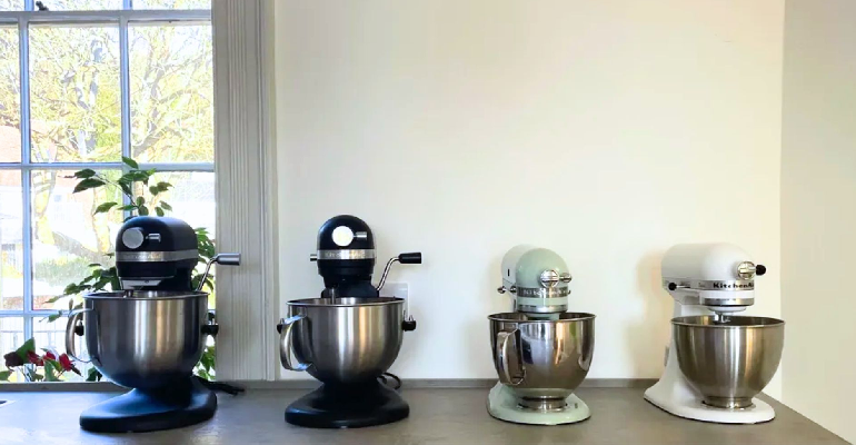
The KitchenAid stand mixer is the most aspirational small appliance in home baking. It has been photographed in millions of kitchens, gifted to millions of newlyweds, and sat on millions of countertops both used and unused. It is genuinely a quality product with a legitimate heritage — the basic design has been manufactured since 1937 and the attachment ecosystem is one of the most extensive in the appliance category. It is also not always the right answer. And the answer to which stand mixer you should actually own depends on what you bake, how much of it you bake, and whether the KitchenAid’s particular set of strengths and weaknesses match your specific baking habits. KitchenAid Artisan — what it does well and where it falls short The KitchenAid Artisan 5-quart (the most commonly purchased model, around $450-500) is a tilt-head mixer with a 325-watt motor and three attachments: a wire whip, a flat beater, and a dough hook. It handles cake batters, cookie dough, whipped cream, meringue, and light bread doughs with genuine excellence. The tilt-head design makes adding ingredients during mixing simple. The honest limitations: the 5-quart bowl is smaller than it sounds. A standard bread dough recipe for two loaves sits at the upper boundary of what the Artisan can handle without straining the motor. Dense doughs — bagels, pretzels, pizza with high hydration — push the motor in ways that produce the laboring-motor-smell that KitchenAid owners who bake bread frequently recognize. The 325-watt motor is adequate for the tasks the mixer is designed for and genuinely insufficient for heavy-duty bread baking at volume. The attachment ecosystem is the Artisan’s most genuinely compelling feature for people who bake and cook broadly. Pasta roller, pasta extruder, ice cream bowl, meat grinder, spiralizer, grain mill, sausage stuffer — the same KitchenAid power head that handles meringues on Tuesday can be making pasta dough on Thursday. No other stand mixer has an attachment library this complete. KitchenAid Professional 600 — for serious bread bakers The KitchenAid Professional 600 (6-quart bowl, 575-watt motor, bowl-lift design, around $600-700) is the machine KitchenAid bread bakers who’ve stressed their Artisan should be using. The larger motor handles heavier doughs without laboring, the larger bowl accommodates double recipes, and the bowl-lift design (rather than tilt-head) provides more structural stability under load. The trade-off versus the Artisan: the bowl-lift design is slightly less convenient for adding ingredients during mixing because you lower the bowl rather than tilt the head, and the machine is noticeably heavier and larger — if you move it frequently or don’t have dedicated counter space, this matters. Bosch Universal Plus — the honest competitor The Bosch Universal Plus costs around $400-450 and makes a genuinely strong case against the KitchenAid for bread bakers specifically. The 800-watt motor handles bread doughs — including dense, high-hydration doughs — without the straining that characterizes the KitchenAid Artisan at its limits. The 6.5-quart bowl accommodates larger batches. The planetary mixing action (where the attachment moves both around the bowl and on its own axis) is efficient and thorough. The Bosch’s weaknesses versus KitchenAid: the attachment ecosystem is smaller (though meaningful attachments exist), the design is more utilitarian and less beautiful (the KitchenAid is genuinely the more attractive machine), and the brand recognition in North America is lower, which affects the resale market and the availability of secondhand machines at good prices. For someone whose primary stand mixer use is bread baking: the Bosch is the better machine. For someone who bakes a wide variety of things (cakes, cookies, meringues, light doughs) and wants attachments for pasta and more: the KitchenAid’s ecosystem advantage matters. The genuinely good budget option — Cuisinart SM-50 The Cuisinart SM-50 5.5-quart stand mixer costs around $200-250 and performs better than its price suggests for most standard baking tasks. The 500-watt motor handles most batters and doughs adequately. The 5.5-quart bowl is slightly larger than the KitchenAid Artisan’s 5-quart. The honest limitations: the Cuisinart’s build quality is not in the same category as KitchenAid. Plastic components in the mechanism area produce a feel that’s noticeably different from the all-metal construction of the KitchenAid and Bosch. Over five to eight years of regular use, these differences compound. For a home baker who bakes two or three times a week consistently, the KitchenAid is likely the better long-term investment. For a home baker who bakes occasionally and wants a capable stand mixer without the full KitchenAid investment, the Cuisinart delivers genuinely good value. What attachments are actually worth buying The pasta roller and cutter attachment ($80-100) is the KitchenAid attachment that produces the most dramatic “why didn’t I have this earlier” reaction from people who make pasta. Fresh pasta in a stand mixer with the pasta roller takes about thirty minutes from flour to pasta sheet and produces results that compare favorably with pasta machines costing the same amount. The ice cream bowl ($70-80) requires advance planning (the bowl needs to freeze for at least fifteen hours before use) but produces genuinely excellent ice cream, gelato, and sorbet. The yield is 1.5-2 quarts, the texture is smooth, and the flavor potential of homemade ice cream is significantly higher than commercial because you choose the ingredients. The meat grinder attachment ($45-60) is the practical attachment that changes how you buy and use meat. Grinding your own burger blends, sausage mixtures, and meatloaf combinations produces a texture and flavor that pre-ground commercial meat doesn’t match, and you know exactly what’s in the mixture.
Everlane Honest Review — Years of Buying From Them, Honest Verdict

Everlane launched in 2011 with a concept called radical transparency — they would publish the cost of making each garment and their markup so customers could see exactly what they were paying for. It was a compelling pitch at the right moment and it built significant brand loyalty among people who wanted to feel good about where their clothing dollars were going. In 2026, the picture is more complicated. The radical transparency has become less radical as the company has navigated commercial realities. The product quality has fluctuated. The brand has faced and addressed criticism around labor practices. And the fundamental question — is Everlane worth paying more than fast fashion for their basics — has a more nuanced answer than their marketing suggests. I’ve been buying from Everlane since 2016. Here is what genuine long-term ownership produces as an assessment. What Everlane does well — specific pieces worth buying The Day Glove Flat is the Everlane product I’d recommend most confidently without qualification. The point toe flat in their Italian leather is genuinely well-made — the leather is soft from the first wear rather than requiring a painful break-in period, the construction holds up to daily wear, and the design is classic enough to have remained in their range for years without revision. At around $165, it competes with shoes at significantly higher price points from brands without the direct-to-consumer cost efficiency. The 100% Human collection (their basic tees and sweatshirts) offers the best value in their range. The organic cotton weight is above average, the construction is clean, and the fit across sizes is consistent in a way that’s not always true across Everlane’s other product lines. A $35 t-shirt from Everlane outlasts equivalent items from H&M or ASOS by a margin that justifies the price difference. The Uniform Chino is the specific trouser worth mentioning — the slim fit in their stretch twill fabric is well-calibrated, the color range includes neutrals that work in professional contexts, and the price ($68-78) is competitive with similar quality at J.Crew without the markups that come with physical retail. Where Everlane disappoints — honest assessment The Cashmere collection is the area of most consistent criticism and it’s fair criticism. Everlane’s cashmere is Mongolian cashmere at a price point that makes it accessible — around $100 for a crewneck. The fiber quality is at the lower end of what can be described as cashmere, and pilling begins earlier than you’d expect for a piece at $100 and considerably earlier than you’d expect if you’ve owned premium cashmere at higher price points. This isn’t fraudulent — the fiber is cashmere, the price reflects the quality — but the marketing positions it as a meaningful upgrade from cheaper alternatives and the longevity evidence suggests the upgrade is less significant than presented. A $30 cashmere sweater from a charity shop that’s a quality secondhand piece will often last longer than a new Everlane cashmere. The denim has received mixed reviews that have become increasingly mixed over the years. Earlier Everlane denim was well-reviewed for quality at accessible pricing. More recent releases have received criticism for stretch-out and shape retention that falls below what the price suggests. This is an area I’d approach cautiously and buy from one of the dedicated denim brands reviewed elsewhere instead. Everlane vs Uniqlo — the honest comparison This comparison comes up constantly because both brands occupy the quality-basics-at-accessible-prices space. My assessment after buying extensively from both: Uniqlo wins on consistent quality, especially in their Heattech, Supima cotton, and merino wool lines. The quality-to-price ratio at Uniqlo is arguably better across a wider range of their catalogue than Everlane’s inconsistent range. If you’re choosing between them for basics, Uniqlo is often the correct answer. Everlane wins on specific pieces — particularly the Day Glove Flat, the 100% Human tees, and some of their tailored pieces — and in the category of “brand story matters to me.” The transparency concept, though evolved from its original form, produces a shopping experience that feels more considered than Uniqlo’s mass-market presentation. For a closet that’s trying to be quality-conscious without spending premium prices, both brands have a role — Uniqlo for consistent, reliable basics in fabric categories they’ve mastered; Everlane for specific pieces where their direct-to-consumer efficiency produces genuinely good value.
Home Office Setup Ideas That Are Actually Productive and Look Good

Working from home has produced a specific and depressing category of workspace: the kitchen table with a laptop pushed to one side to make room for breakfast, or the bedroom desk that means your brain never fully separates work from sleep. Neither of these is a proper workspace and neither produces the focus, output, or general satisfaction that a well-considered home office setup does. A proper home office doesn’t require a dedicated room, though that’s obviously ideal if available. It requires intention applied to a specific area — a corner, a wall, a part of a larger room — that signals to your brain that this space is for focused work. Here is how to create that space without spending more than you need to. The chair — the investment that pays back in your body Office chairs are the most consequential home office purchase and the one most people underspend on. Eight hours per day in a chair that doesn’t support the spine properly produces cumulative damage that manifests in back pain, shoulder tension, and fatigue that gets attributed to “staring at a screen” when it’s actually coming from the chair. The Herman Miller Aeron is the reference standard office chair. At $1,500-2,000 new, it’s a significant investment that requires the argument that eight hours per day for five years of comfortable, properly supported seating amortizes the cost to approximately $0.80-1.00 per hour of use. Many employers will contribute to home office chair purchases as a workplace accommodation — worth asking before buying. The Steelcase Leap is the second reference-standard chair at a similar price. The key mechanical difference from the Aeron: the Leap’s back flexes with your movement rather than having the Aeron’s fixed lumbar support zone. For people who find the Aeron’s lumbar position doesn’t hit the right spot, the Leap often fits better. The genuinely good budget option: the Branch Ergonomic Chair costs around $500 and receives consistently strong reviews for lumbar support and adjustability at its price point. It’s not an Aeron replacement but it’s meaningfully better than the office chairs sold at office supply stores for $150-200. What to avoid: mesh chairs that sag within a year, chairs without height-adjustable armrests (armrest height affects shoulder tension significantly), and anything marketed primarily on how it looks rather than how it supports the body. The desk — the surface that determines everything else Standing desks (height-adjustable desks, technically) have moved from novelty to near-standard in well-considered home office setups. The ability to alternate between sitting and standing during the day reduces the back tension and energy slump associated with prolonged sitting and improves overall output for most people who have tried the combination. The FlexiSpot E7 Pro is around $400-500 and is the most frequently recommended standing desk in online home office communities — robust build quality, programmable heights, stable at standing height. The Uplift V2 at a similar price is the other consistent recommendation. If a standing desk is not in the budget: a desk at the correct sitting height is more important than a standing desk. Correct sitting height means your elbows are at roughly 90 degrees when your forearms rest on the desk, your monitor is at eye level (not below it, which causes the head-drop posture that contributes to neck pain), and your feet are flat on the floor or on a footrest. Monitor placement: the top of the monitor should be at or slightly below eye level, the monitor at arm’s length distance from your face, and the monitor tilted slightly back (top of screen slightly further from you than bottom). A monitor arm ($30-80) that mounts to the desk and allows height and angle adjustment is one of the most impactful ergonomic investments because it decouples monitor position from whatever surface the monitor would otherwise sit on. Lighting — the element most home offices get wrong Natural light from the side is ideal — not behind the monitor (creates glare), not behind you (creates reflection on the screen), but from the side so it illuminates your face and workspace without interfering with the screen. Artificial lighting for a home office should include: a desk lamp positioned to illuminate the work surface without creating screen glare, ambient room lighting warm enough to be comfortable for extended hours, and if you’re on video calls, a ring light or key light (the Elgato Key Light Air is the reference at around $100) positioned in front of you to light your face evenly. Bias lighting — a strip of LED lights behind the monitor — reduces eye strain by reducing the contrast between the bright monitor and the dark background around it. The Govee RGBIC Bias Lighting strips are around $15-30 and the difference in eye comfort during long work sessions is real and measurable. Cable management — the detail that separates organized from chaotic A desk with visible cable chaos looks like a problem waiting to be solved regardless of how good the equipment on it is. Cable management is the single most impactful visual change to an existing setup and costs almost nothing. Cable clips (adhesive clips that route cables along the desk edge), cable raceways (plastic channels that conceal multiple cables along a wall), a cable box (an enclosure that hides a power strip and the nest of cables feeding into it), and velcro cable ties (reusable, better than zip ties because they don’t require cutting and re-doing when cables change) are the four tools that solve most cable situations for under $30 total. Under-desk mounting — using adhesive mounting strips or brackets to attach a power strip to the underside of the desk — removes the power strip and its cables from the visible workspace entirely. This is the most dramatic single cable management change and requires no drilling or permanent modifications in most cases. The accessories that genuinely improve work output A wrist rest for keyboard and mouse — not a luxury, a functional tool for anyone who