
Interior design as an industry has a specific interest in making you believe that the way to a beautiful home is spending more money on better things. This is obviously true up to a point and completely misleading beyond it. There are apartments furnished almost entirely from thrift stores and Ikea that look more genuinely considered and beautiful than houses that have had six figures spent on them by professional decorators. The difference is almost never budget. It’s almost always decisions.
Interior design as an industry has a specific interest in making you believe that the way to a beautiful home is spending more money on better things. This is obviously true up to a point and completely misleading beyond it. There are apartments furnished almost entirely from thrift stores and Ikea that look more genuinely considered and beautiful than houses that have had six figures spent on them by professional decorators. The difference is almost never budget. It’s almost always decisions.
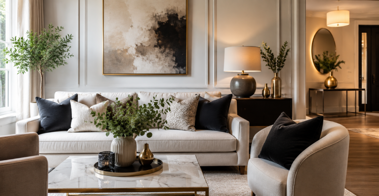
Every professional stylist and designer who is being honest will tell you that the most common problem in residential spaces is too much stuff. Not the wrong stuff — too much stuff. Collections of small objects that individually mean something but collectively produce visual noise. Too many throw pillows in too many colors. Too many pieces of wall art hung too close together so each one loses its impact. Side tables covered in objects that were placed there once and never moved since.
The editing instinct — the willingness to remove things from a space rather than add to it — is the single most reliably impactful thing you can develop when it comes to making a home look better. It is also the hardest because it runs against every natural impulse. Removing things feels like making the space emptier. In practice, removing the right things makes the space feel calmer, more intentional, and paradoxically larger.
The exercise that actually works: go into a room with a large box and remove everything you could remove. Every object off every surface, every decorative pillow, every piece of art off the wall. Live with the empty space for a day or two. Then add things back deliberately, one by one, only when you’re certain they’re earning their place. What you find is that you rarely need to add everything back. The things you add back matter more when they’re not competing with everything else.
Fresh paint costs between $50 and $150 in materials depending on the size of the room and the quality of the paint. It transforms a space more completely than any furniture purchase at any price. A room with scuffed, dirty, slightly-wrong-color walls and excellent furniture looks worse than a room with freshly painted walls and modest furniture. Paint quality is the background condition that everything else sits against.
The color conversation is complicated because there are no universally correct answers, but there are some patterns worth knowing. White is harder than it looks — there are hundreds of whites, most of which are actually very pale versions of other colors, and the wrong white will cast a color onto everything in the room. Benjamin Moore White Dove, Chantilly Lace, and Simply White are the three whites that consistently work across the widest range of natural light conditions. Farrow & Ball’s All White and Shaded White are the UK equivalents.
For people who want color: undertones matter more than the color family. A blue that pulls green reads completely differently in a room than a blue that pulls purple, even if they appear nearly identical on a paint chip. Testing paint on actual walls — not paint chips, which are too small and viewed under artificial light — before committing is not optional if you’re investing time and money in painting a full room.
The finish matters. Flat/matte finishes look most elegant on walls but show marks and can’t be wiped clean. Eggshell is the practical choice for most rooms. Satin for kitchens and bathrooms. Semi-gloss only for trim and doors, where the contrast between the sheen of the trim and the matte of the wall is a genuinely good-looking detail that costs nothing extra.
Almost every home I’ve been in that felt slightly off without an obvious reason has had one specific problem: curtains hung too low, too short, and too narrow. This is the most common decorating mistake in residential spaces and it costs nothing to fix except the effort of rehang.
Curtains should be hung as close to the ceiling as the rod can be placed — ideally within two to four inches of the ceiling or crown molding. They should fall to the floor, either just grazing it (about a half-inch clearance) or pooling slightly (about an inch to an inch and a half of fabric resting on the floor for a more luxurious look). They should be wide enough that when closed they cover the window frame by several inches on each side and when open they stack on the wall rather than over the window.
The reason this matters: curtains hung at the top of the window frame make the ceiling feel low and the window feel small. Curtains hung near the ceiling and falling to the floor make the ceiling feel high and the room feel more expansive. The rod position alone — same curtains, different height — can make a room feel like two different spaces.
Curtain material matters less than most people think at the decorating level. Linen and linen-look fabrics (the more affordable version) in a warm neutral — ivory, cream, warm white, natural — work in almost any room in almost any style. Heavy velvet or silk curtains are beautiful but expensive and more commitment-specific. Sheer curtains layered behind heavier drapes are the approach that gives maximum flexibility — sheer for daytime privacy and light diffusion, heavy panels closed for evening warmth and visual weight.
This has been said before and continues to be said because it continues to be ignored: the rug is almost always too small. If the rug in your living room has all four sofa legs off it and the rug is essentially an island in the middle of the floor that the furniture surrounds, the rug is too small and it’s making every piece of furniture look like it’s floating.
The minimum for a living room rug: the front two legs of the sofa and all legs of the coffee table should be on the rug. Ideally all four legs of the sofa too. This means that most people who think they need an 8×10 rug actually need a 9×12.
In bedrooms: the rug should extend at least 18-24 inches beyond the sides and foot of the bed. Waking up and putting your feet on a rug rather than cold floor is part of the experience. A bed sitting entirely off a rug — rug positioned only at the foot of the bed — is a decorating choice that consistently looks unresolved.
The workaround for people who can’t afford larger rugs right now: layer rugs. A larger, neutral, lower-cost rug underneath a smaller, more interesting rug on top is a designer trick that works genuinely well and can be achieved at a fraction of the cost of one large quality rug. Natural fiber rugs — jute, sisal, seagrass — make excellent base layers because they’re inexpensive in large sizes, durable, and neutral enough to go under anything.
Most residential spaces are lit by overhead ceiling lights that cast even, flat, slightly clinical light across an entire room simultaneously. This is excellent for spotting things you’ve dropped on the floor and terrible for making a room feel warm, inviting, or beautiful in the evening.
The solution is adding light sources at lower levels: floor lamps in corners, table lamps on side tables and consoles, under-cabinet lighting in kitchens, bathroom vanity lighting at face height rather than above the mirror where it casts unflattering downward shadows. The goal is layered light — multiple sources at different heights that can be used in different combinations rather than one overhead light that’s either on or off.
Warm bulbs — 2700K to 3000K color temperature — make rooms look warm and inviting in the evening. Cool bulbs — 4000K and above — make rooms look like offices. This is one of the most actionable, inexpensive changes anyone can make: replacing cool-white bulbs with warm-white bulbs throughout a home changes the entire character of the spaces in the evening.
Dimmers. If you do one electrical change — just one — put a dimmer switch on the main living room overhead light. Being able to reduce the overhead light to 30% in the evening and supplement it with lamp light changes the entire feeling of the space. Dimmer switches cost $15-25 and most can be installed without an electrician.
Original art from living artists is one of the genuinely worthwhile things to spend decorating money on, both because of how it looks and because of what it represents. Society6, Saatchi Art, and Etsy all have original prints from emerging artists at prices ranging from $20 to a few hundred dollars. A collection of three framed prints from an artist whose work you genuinely respond to, in frames from Ikea’s Ribba or Rödalm range, looks more personal and more expensive than a mass-produced canvas purchased from a home goods store at three times the price.
The framing matters more than the art in terms of how expensive the result looks. Quality frames — real wood, clean lines, appropriate mat width — make modest prints look gallery-worthy. Cheap frames — thin metal, no mat, visible backing — make expensive prints look discount. Investing $40-60 in a decent frame for a $20 print produces better results than spending $100 on a print in a $10 frame.
Gallery walls look intentional when planned. They look chaotic when they grow organically by hanging things wherever there’s space. The planning process: arrange all the frames on the floor first, photograph the arrangement you like, then transfer it to the wall. Templates made from kraft paper cut to frame size, taped to the wall with blue tape, let you see the layout before committing to holes.