Most bookshelves in most homes look like storage. This is fine — storage is the point. But there’s a version of the bookshelf that does two things simultaneously: stores books and functions as one of the most interesting, personal, visually rich elements in the room. The distinction between the two is almost entirely in approach rather than in the objects being shelved.
Designers who style bookshelves professionally follow a method rather than an instinct. The method is learnable and it produces consistent results regardless of the specific books, objects, and accessories being used. Here it is.
The bookshelf that looks good after editing is almost never the bookshelf that looked bad before it. The impulse is to rearrange what’s already there rather than starting fresh. Rearranging existing disorder produces organized disorder rather than something that looks intentional.
Remove everything. Put it all on the floor. This is uncomfortable because it means committing to the process before seeing any results, but it’s the step that makes the outcome possible.
Not every book needs to be on display. Not every object that has been on the shelf needs to return. This is the editing step — removing things from the shelf equation that aren’t earning their place.
Books you’ve finished, didn’t particularly like, or haven’t touched in years don’t need prime visual real estate. They can go in storage, in a bedroom, or donated. The books that stay on the featured bookshelf should be ones you’d be happy to have a guest pull down, ones that say something about you you’d want said, or ones that are genuinely beautiful as objects.
Decorative objects compete for space with books. The question for each object: does it add to the visual story of this shelf or does it occupy space without contributing? Objects that don’t earn their place go elsewhere.
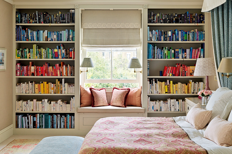
Alphabetical book organization is efficient and visually monotonous. Color organization — all books arranged by the color of their spines, creating gradient effects — is visually striking and practically useless if you ever need to find a specific book. Neither extreme is the answer for a styled bookshelf.
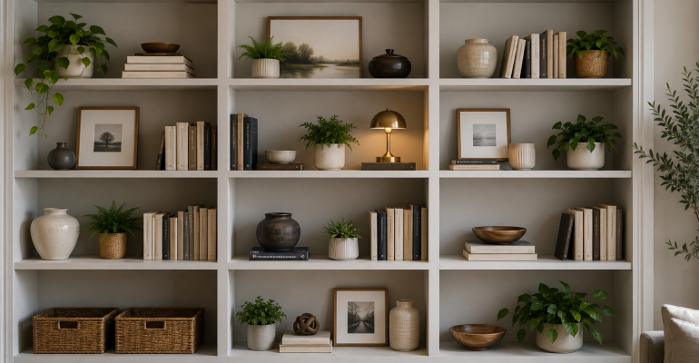
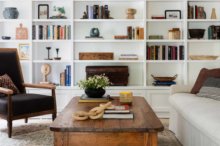
The approach that works: organize in sections defined by size and orientation. Vertical books on one section, horizontal stacked books on another. Varying height creates rhythm — tall books, medium books, a short section with an object on top, then tall books again. The eye moves through the shelf rather than scanning across a uniform row.
Spine-out books alternate with books stacked horizontally, which alternate with sections of objects, which alternate with plants or framed art leaning against the back of the shelf. This horizontal variation is what makes the shelf look designed rather than loaded.
Negative space — empty areas, or areas occupied by a single object against the background of the shelf — is as important as filled areas. The instinct is to fill every available inch. Bookshelves that look considered almost always have some breathing room: a shelf that’s two-thirds full with one or two objects on an otherwise clear surface, a gap between sections.
Objects in odd numbers. Three small objects grouped together look collected. Four look forced. One large object makes a statement. Two objects look like they need a third.
The plant that’s small enough to sit on a shelf — a trailing pothos in a small pot that sits on the shelf and lets a tendril fall over the edge, a small succulent in a pretty pot — adds life and organic texture that no book or decorative object replicates.
Framed photos or small artworks leaning against the back of the shelf (rather than hung on the wall, which reads differently) create a layered depth that flat rows of books don’t have.
A consistent color palette in the objects. The shelf that looks designed usually has objects that share one or two color themes — all ceramics in the same earth-tone family, all metallics in the same warm or cool tone. Objects in five different unrelated colors produce visual confusion.
Variety in height and format. The shelf that has only vertical books at consistent height looks like a library card catalog. Introducing one or two horizontal stacks, one or two objects of different heights, one or two plants — the variety in height and format is what the eye reads as interesting rather than uniform.